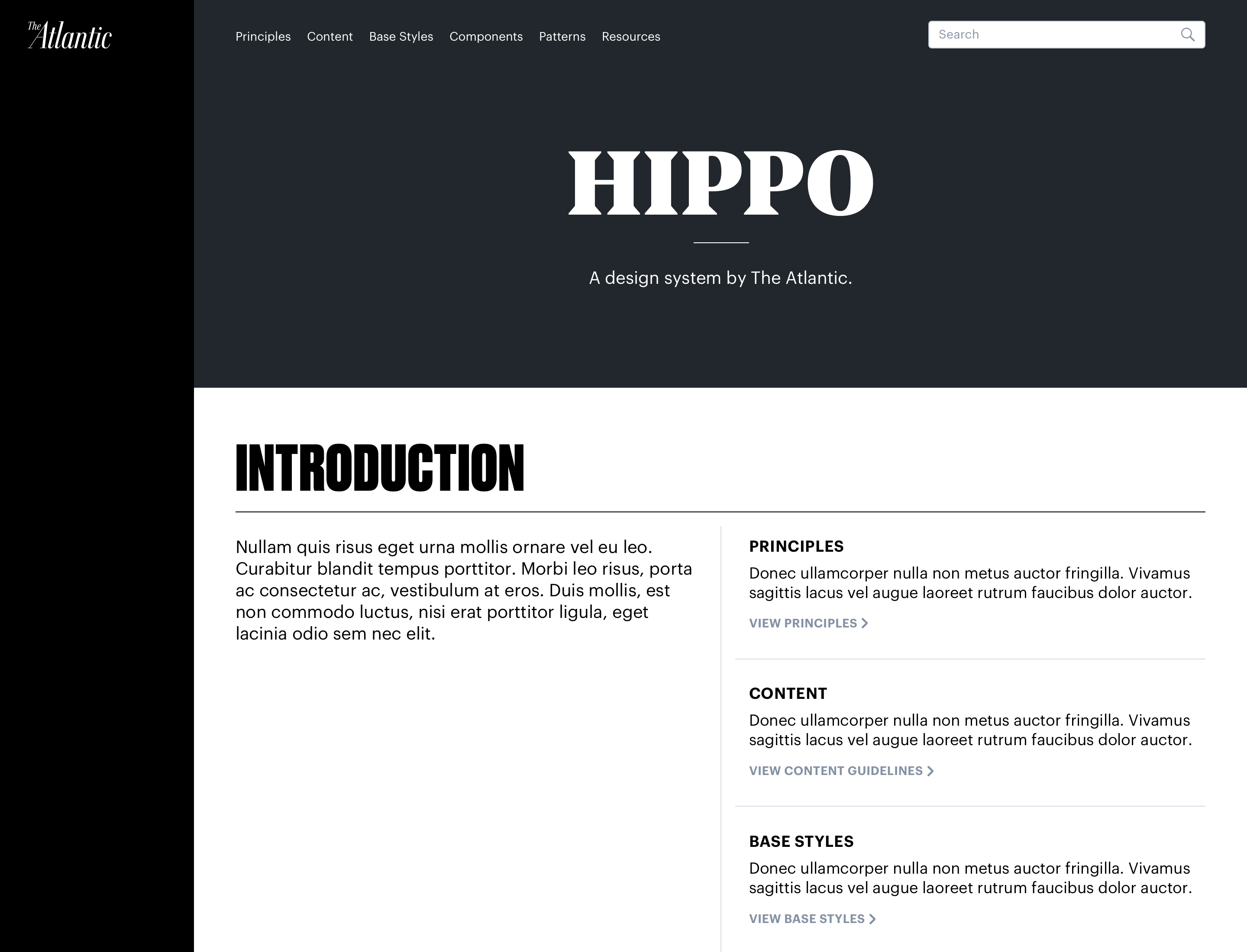
The Atlantic Design System
This project was the culmination of different things I had learned from working in media. A lot of past mistakes and discoveries from previous design systems I worked on informed our approach with this one. The Atlantic's design system continues to live on today as new designers have picked it up and moved it forward.
CREDITS: DJ BRINKERHOFF
ROLES
UX Design
UI Design
Design Ops
Prototyping
PLATFORM
Web Design System
YEAR
2017 - 2018
ROLES
UX Design
UI Design
Design Ops
Prototyping
PLATFORM
Web Design System
YEAR
2017 - 2018
The Goal
While we were a small team, DJ and I had a vision of scalability and how our design team was going to grow. We decided to get ahead of that problem and ensure that the systems and patterns we designed can be picked up and used by others easily.
My goal when working on this was to design for myself. I tried to make it as clear as possible how to create new designs and collaborate with developers.
Component Inventory and Abstract Organization
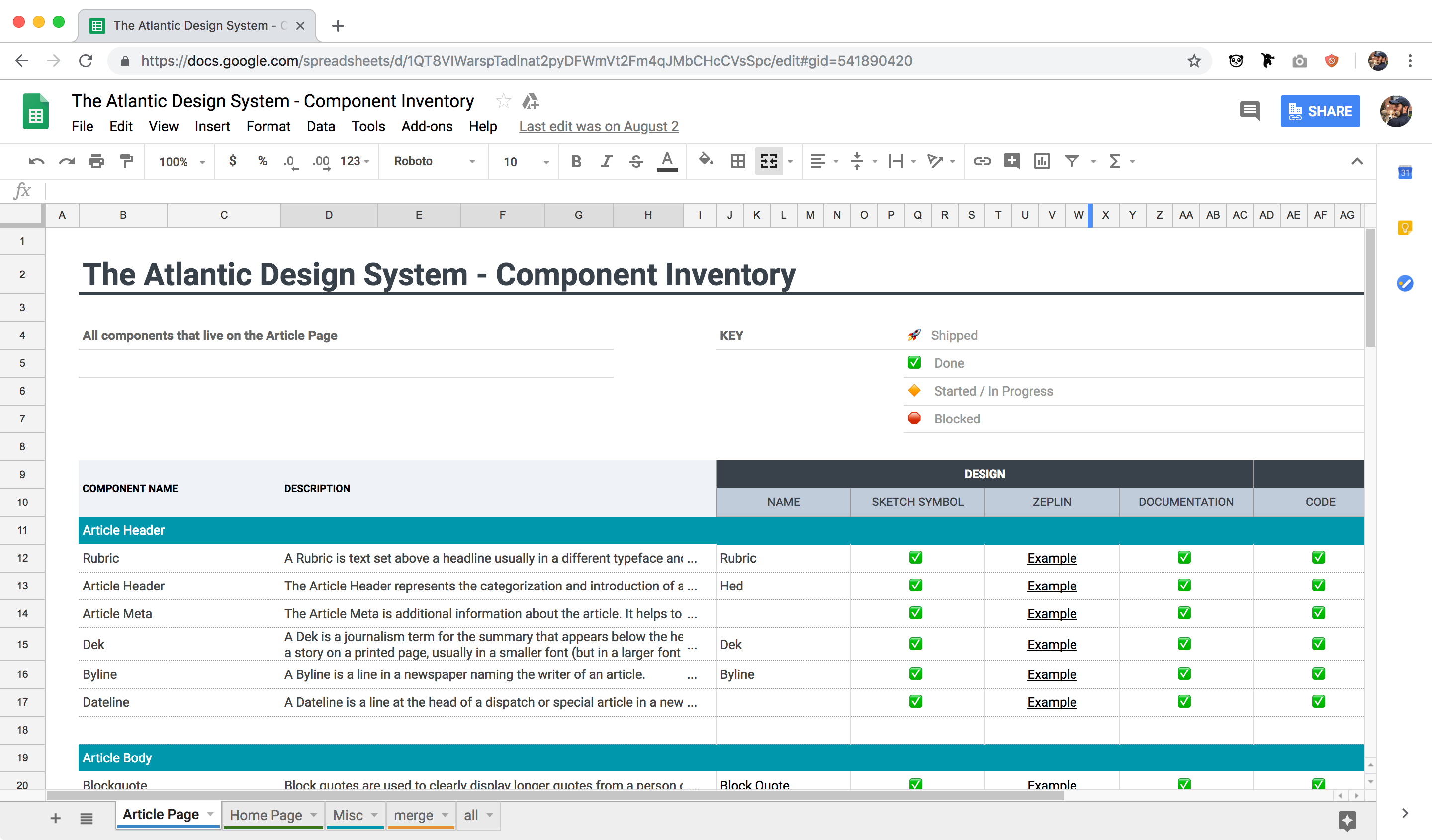
Early in the process we did a lot of analysis and auditing of the current state of our design to inform what work needed to be done. We used the article redesign as a pilot project and I started by auditing every style and component on that page.
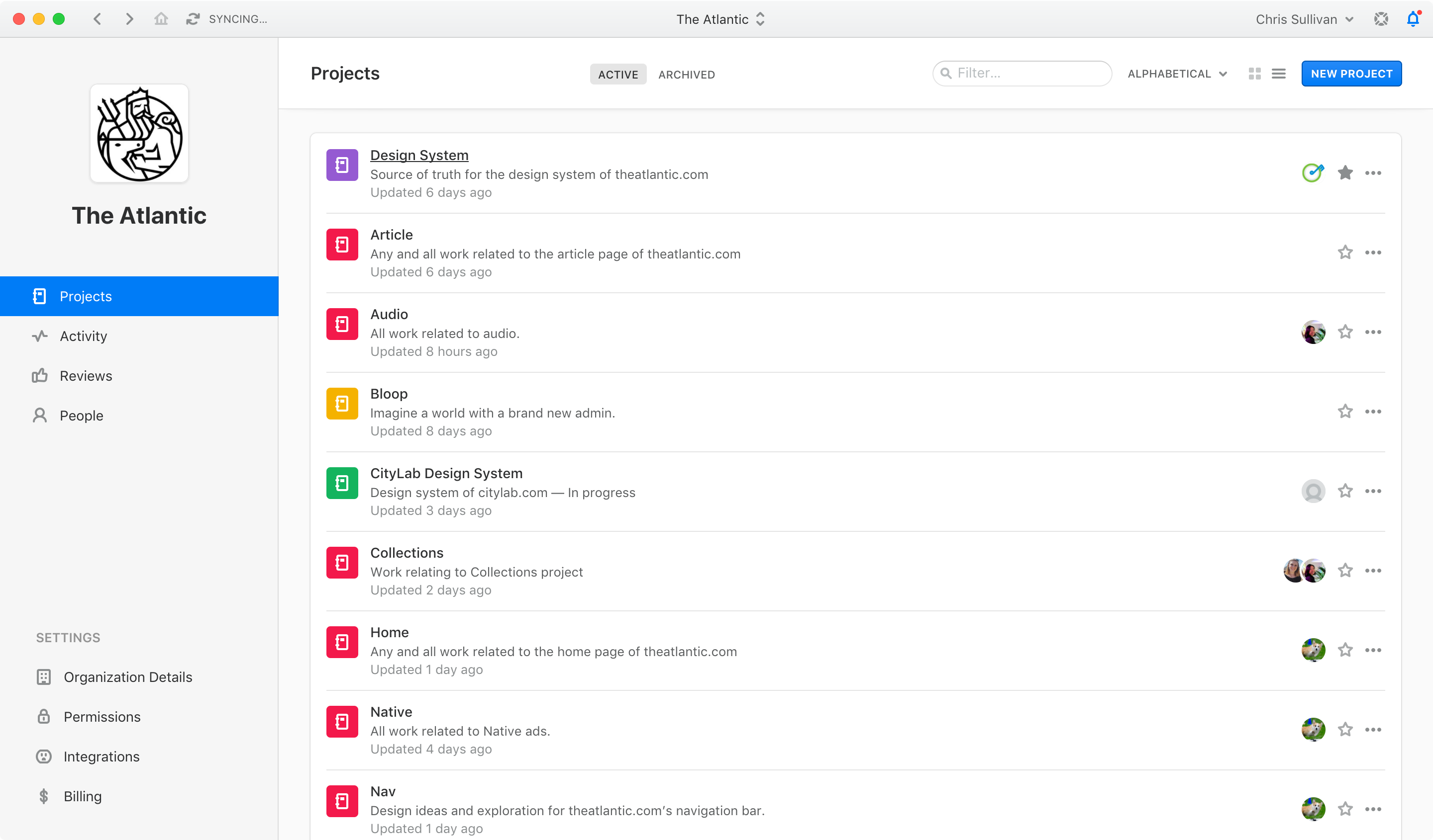
We used that audit to create an inventory that documented what all of the components are and linked to the design assets for each one. We also leveraged Abstract as way to keep designers in sync and make it easier to collaborate on the system we were building.
Sketch Workflow
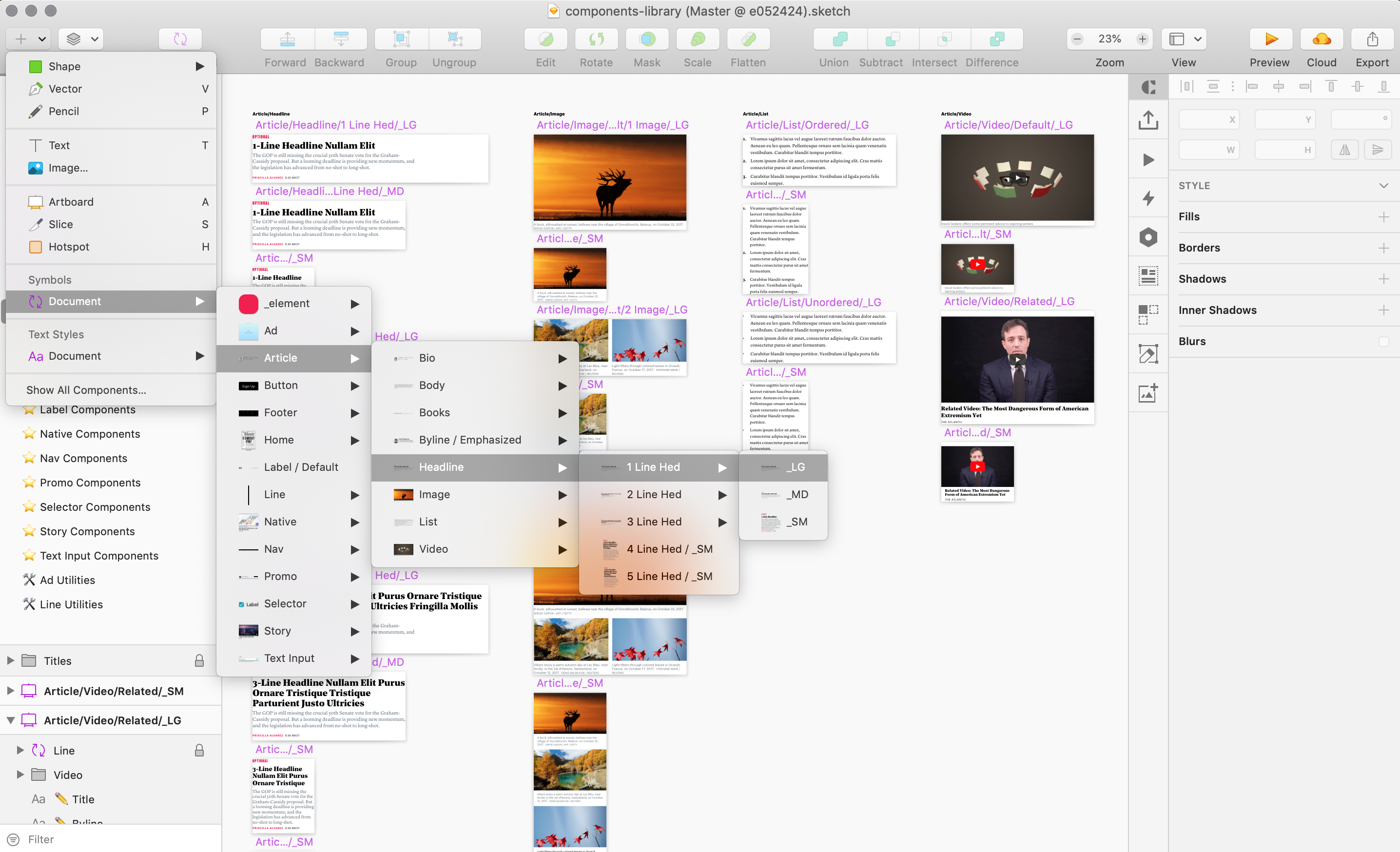
The approach I took for solving our Sketch workflow was to start trying things and just keep using it and tweaking it as I go. The goal was to cater to myself as the user and come up with something that felt intuitive and useful. I find that a lot of the Sketch libraries that you can download online look great, but aren't very easy to learn. So I tried to take best practices from other libraries, while also innovating on areas that I thought could be improved.
Styles and Components
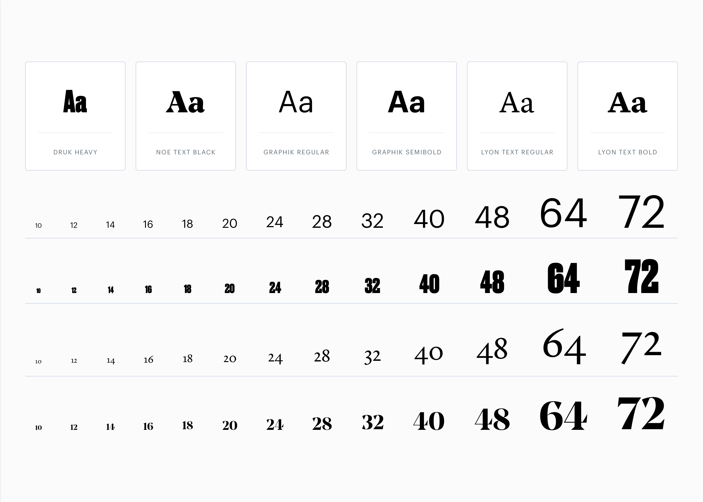
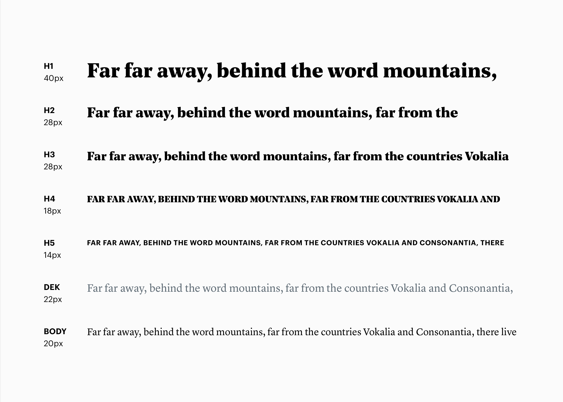
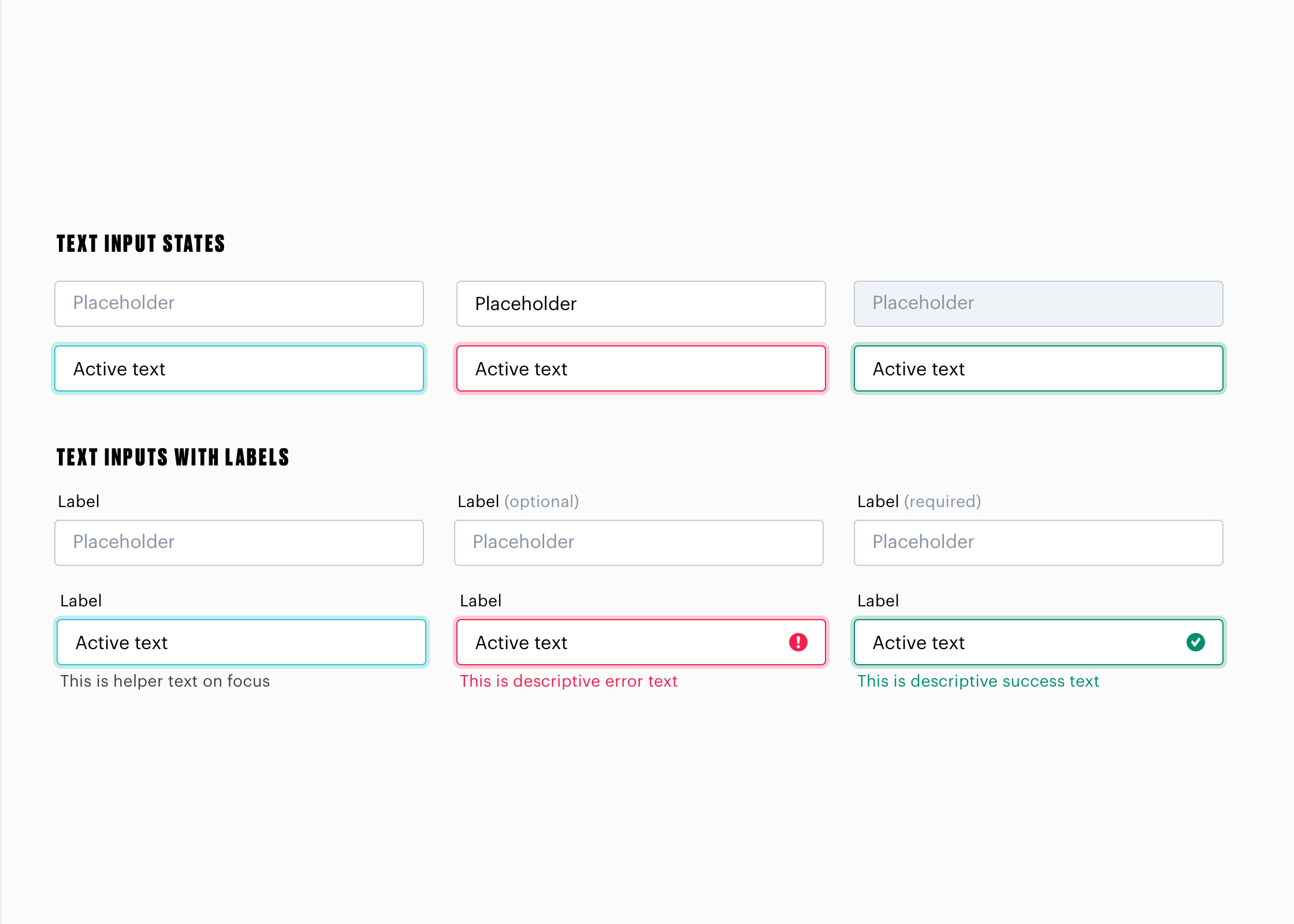
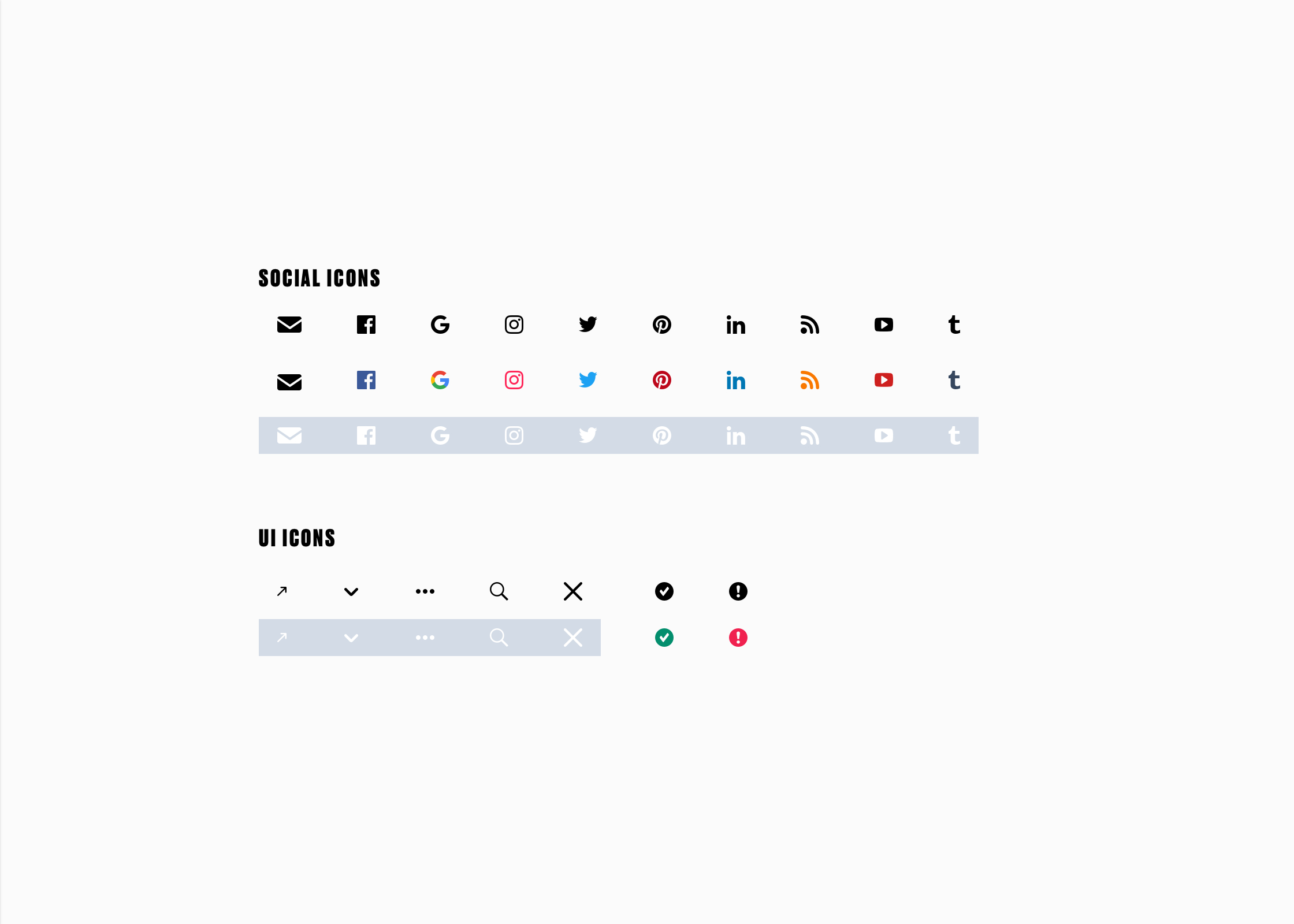
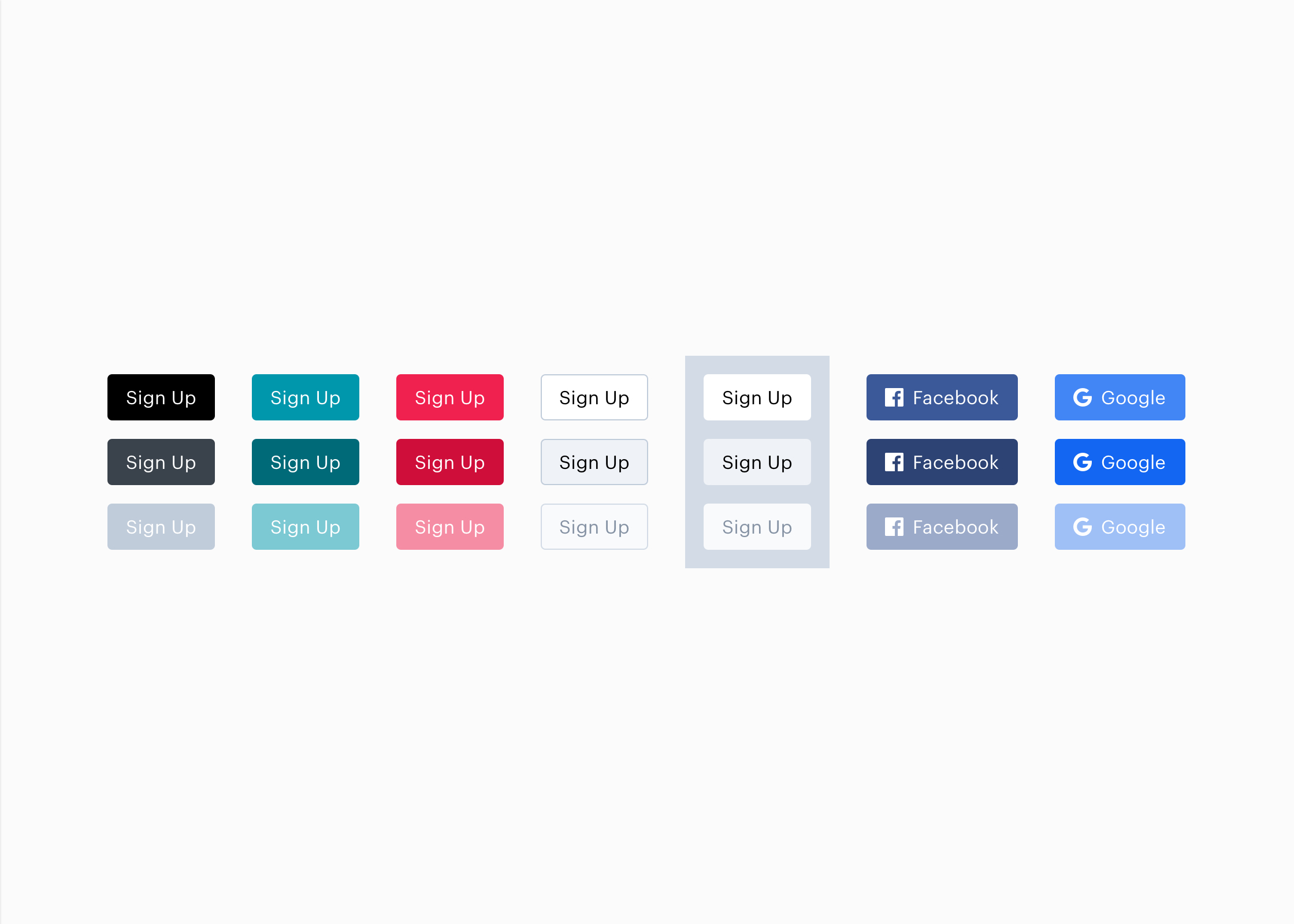
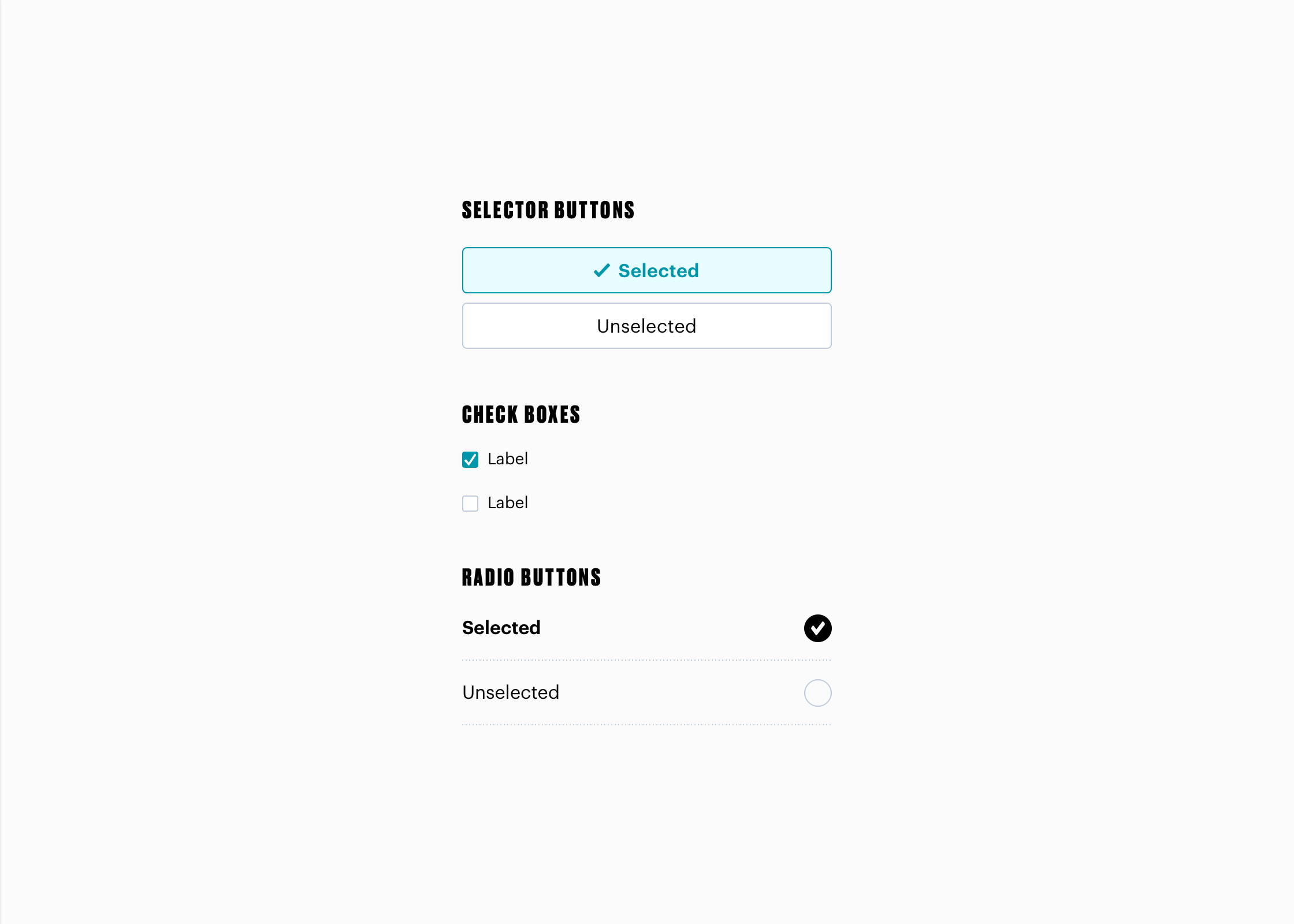
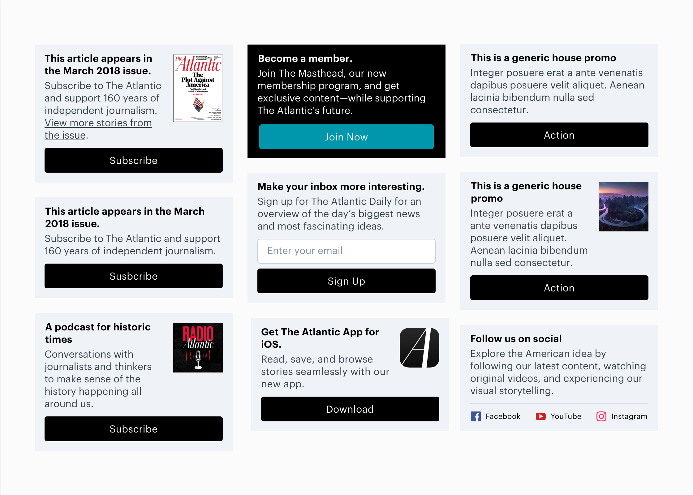
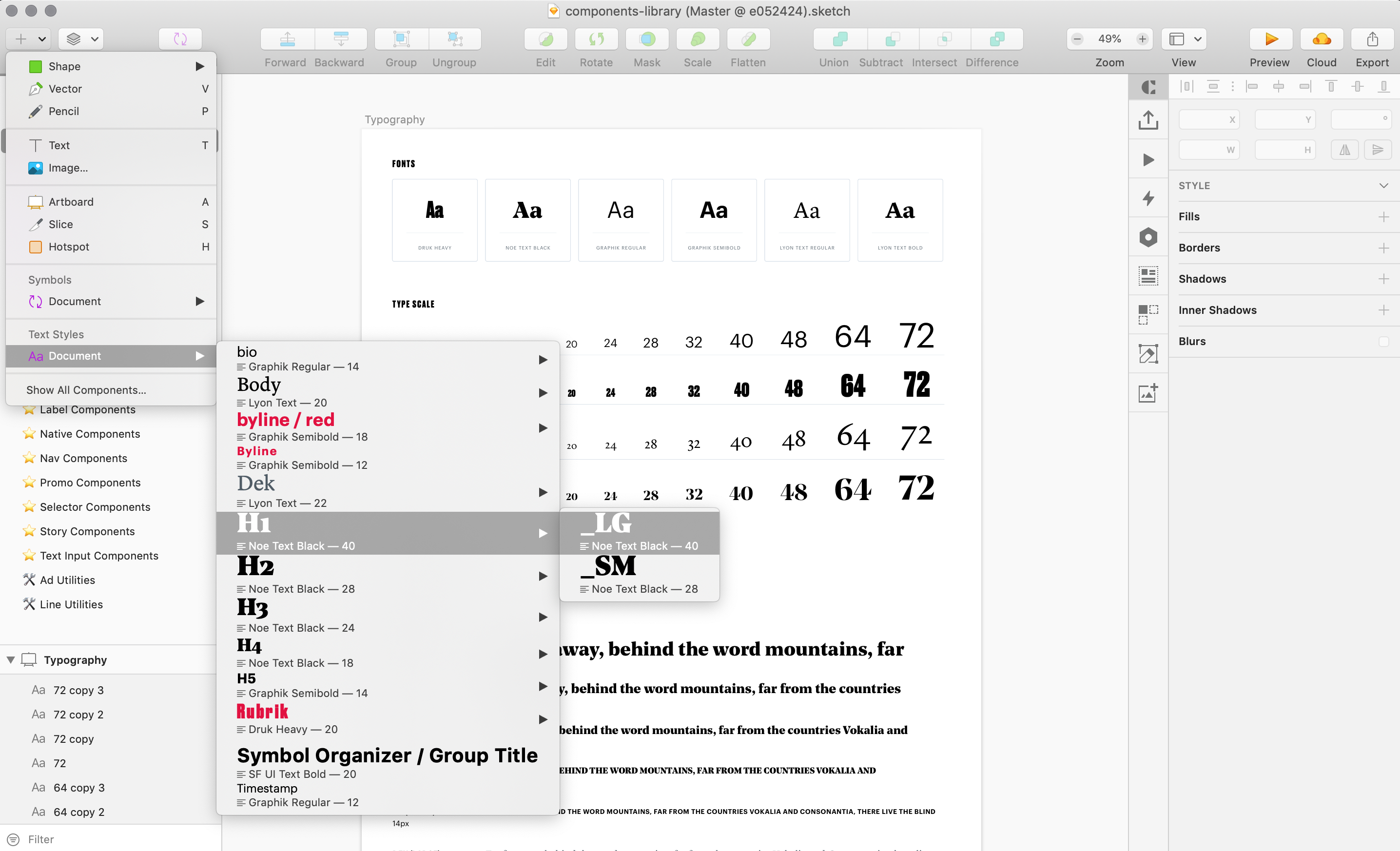
This is a collection of some of the styles and components that we documented in our design system.

