The Atlantic Website
A majority of my time spent at The Atlantic was working on the website experience and was driven by empowering and driving our design system. We used it as a playground to test, validate, and evolve different ideas for design and systemization. It was exciting and empowering to be able to tinker with and explore new ideas for a prestigious and important brand like The Atlantic.
CREDITS: DJ BRINKERHOFF, DAVID SOMERVILLE
ROLES
Research
User Testing
UX Design
UI Design
Prototyping
PLATFORM
Website
YEAR
2017 - 2018
ROLES
Research
User Testing
UX Design
UI Design
Prototyping
PLATFORM
Website
YEAR
2017 - 2018
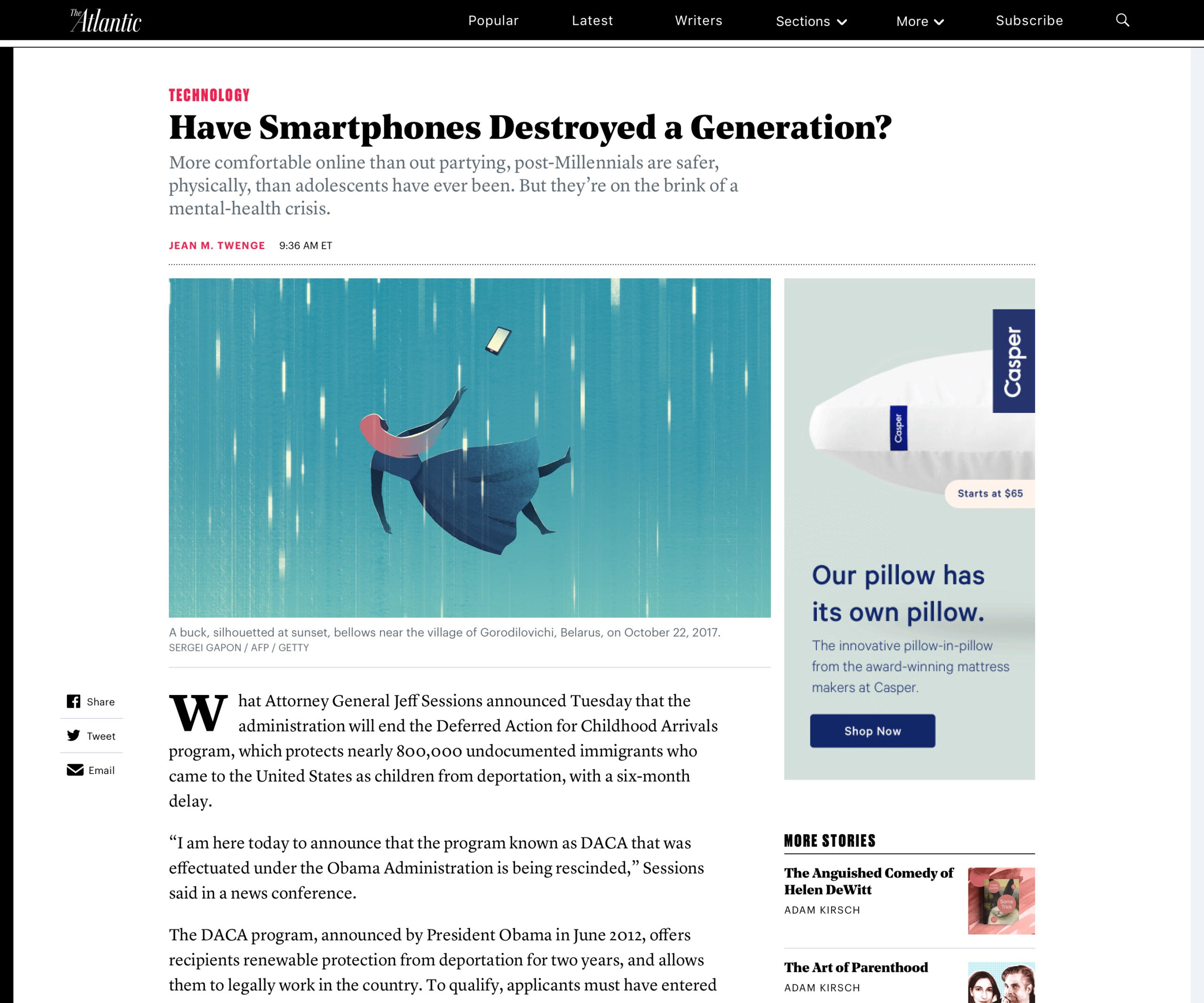
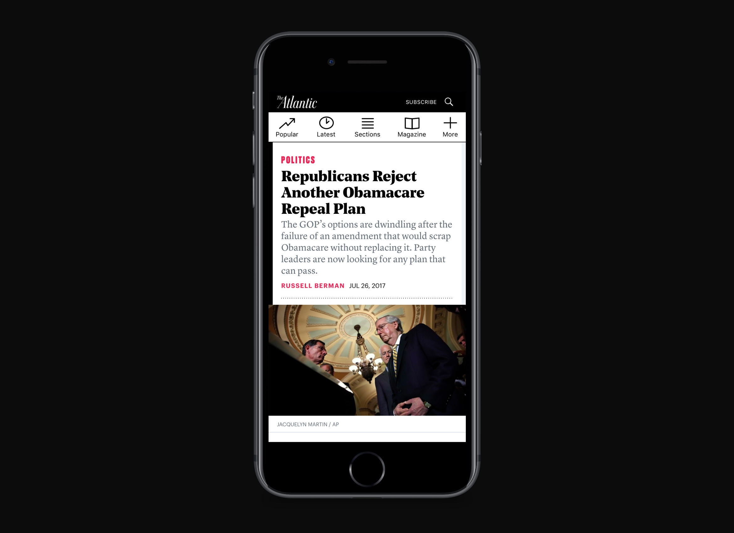
Article Redesign
For most publication, the article page is the highest trafficked page on the site, so getting it right is of the utmost importance. Some goals we had for the redesign of the article were to improve the page speed, improve the typography, and to use it as a pilot for the design system. It proved to be an ambitious and exciting challenge that we made the most out of.
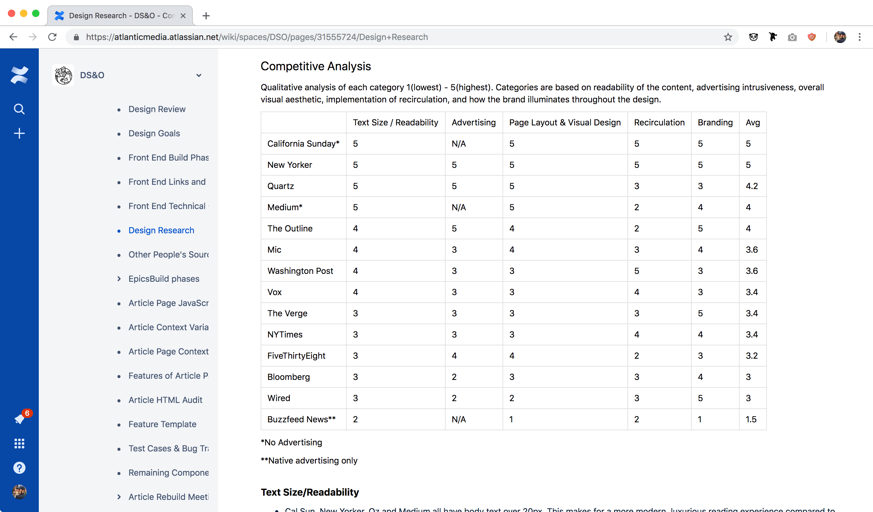
COMPETITIVE ANALYSIS AND COMPONENT AUDIT
We started by doing a competitive analysis of various publications to determine what we liked and didn't like. We were really drawn in by the larger body copy and centered layouts on sites like Medium and California Sunday. We also really appreciated how well integrated the branding from The New Yorker was blended with their site experience.
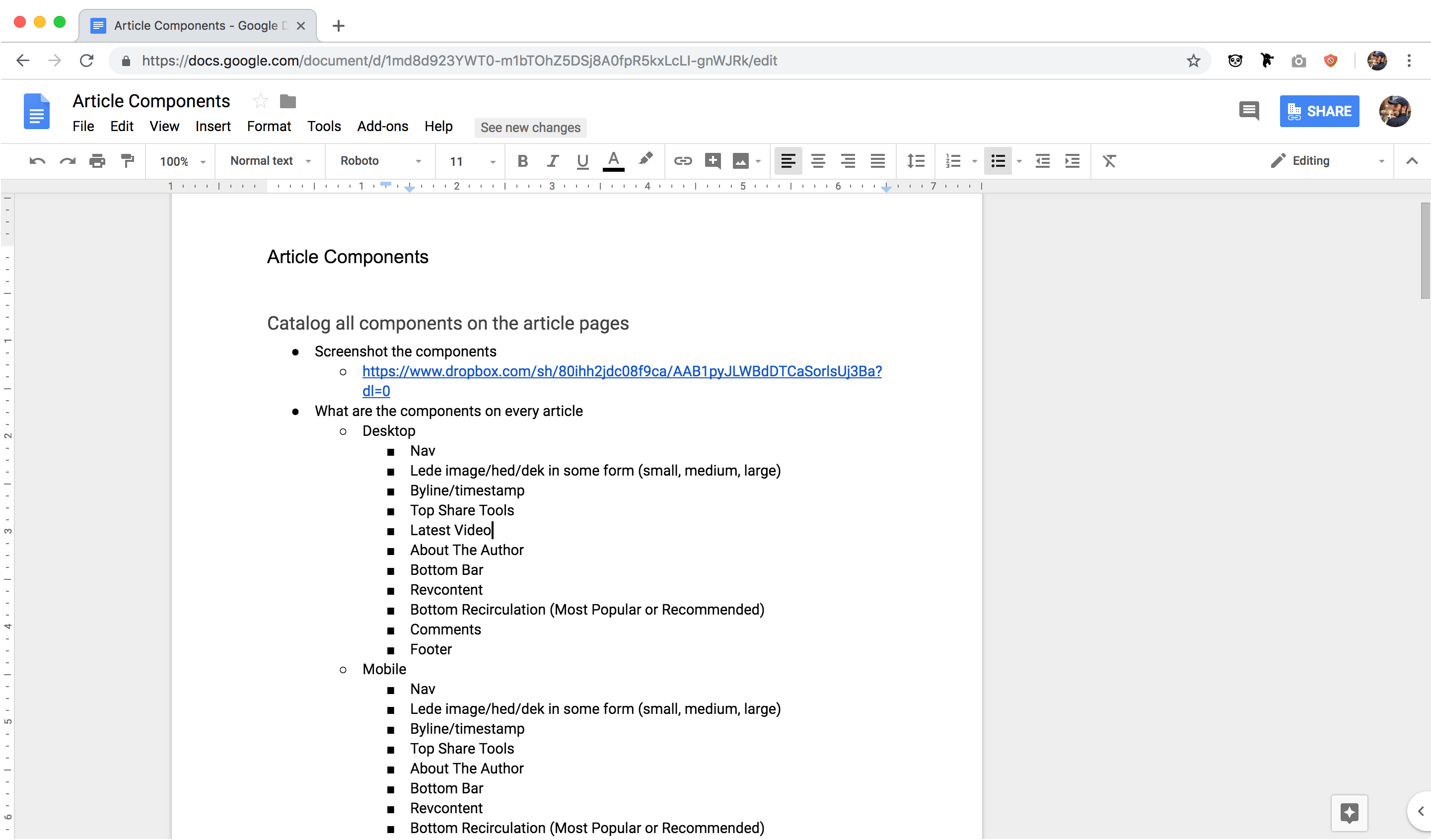
I mentioned this in the design system project, but we used this article redesign as the pilot for the design system effort. We started by auditing the current state of styles and components to consider every piece of the page that needs to be redesigned.
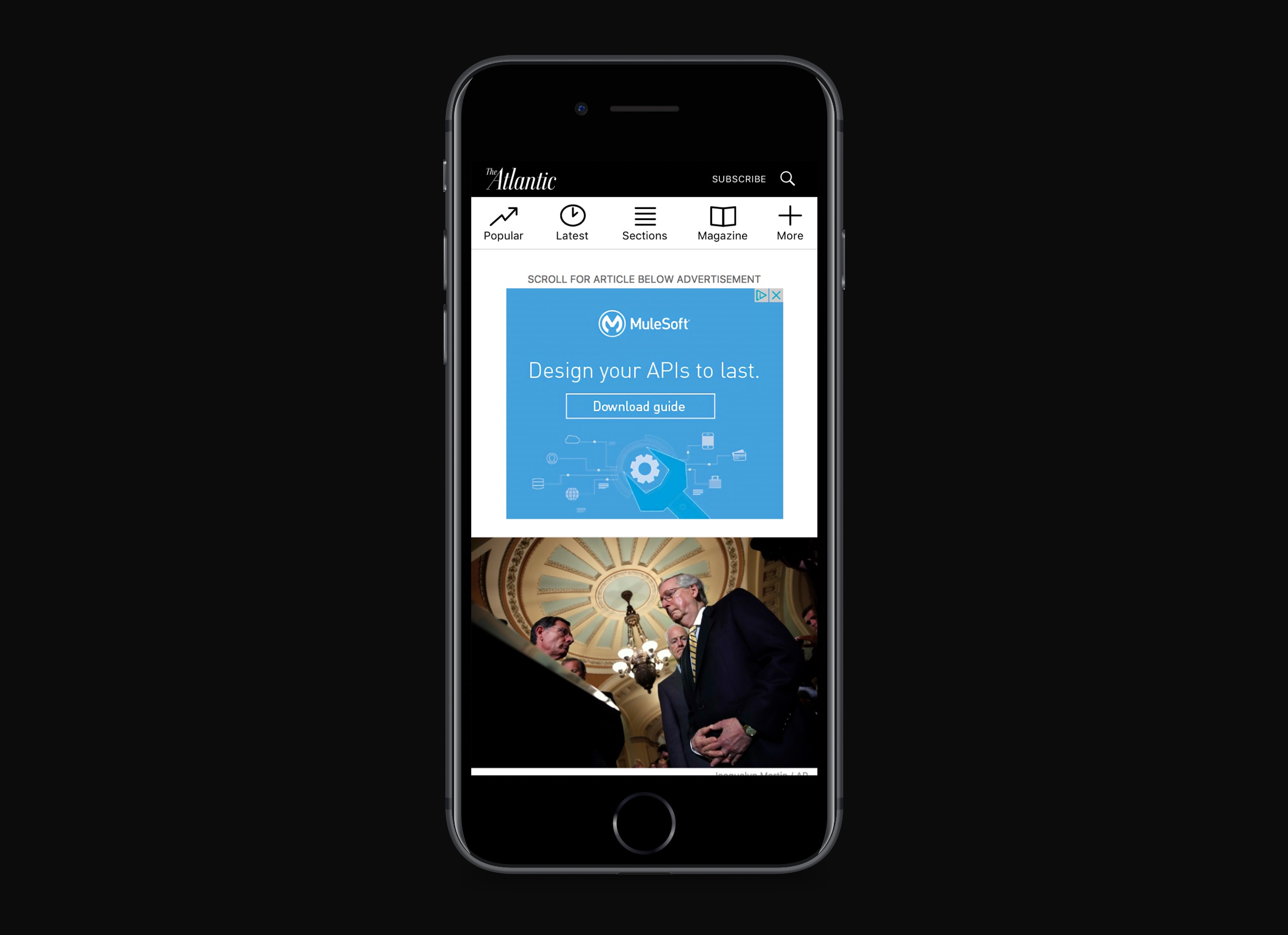
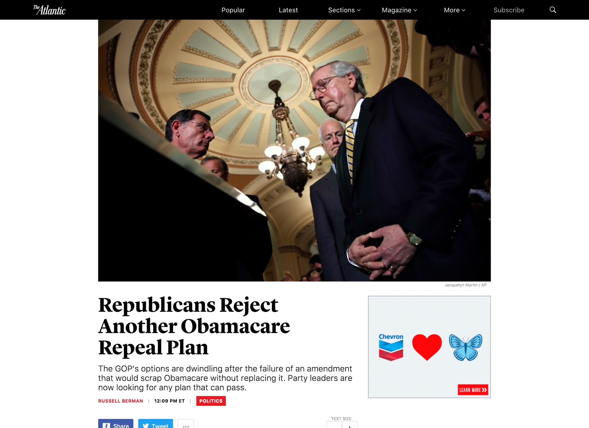
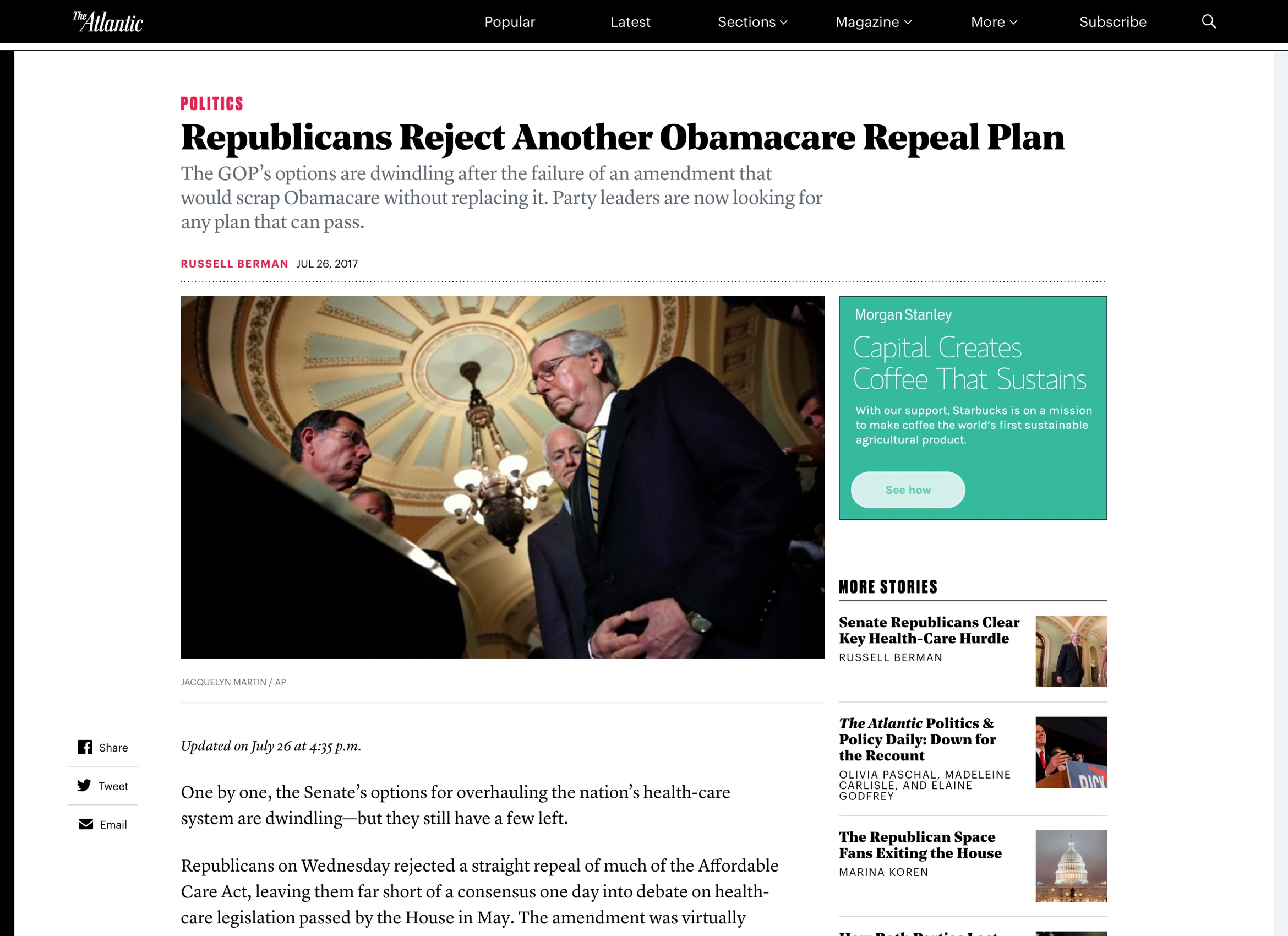
FINAL DESIGN
The design we came up with took a lot of nods from the app project with the key differnce being that the site has ads. Desiging around ads is the nature of our business so making them as discreet as possible is the name of the game. One thing we did to improve the reading experience was to get people reading as soon as possible.
We pushed the first ad out of view from when the page first loads so the user can read something right away. We also moved the shrunk the height of the cover image and moved it down so that a reader can start reading the story sooner.
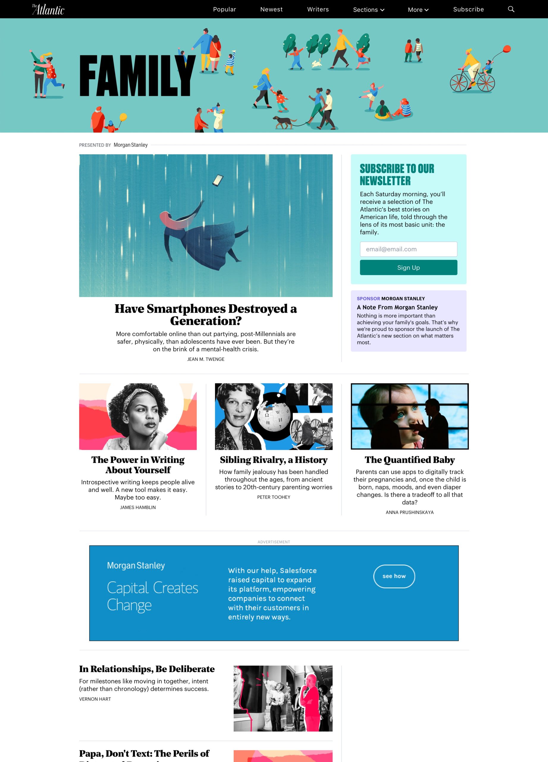
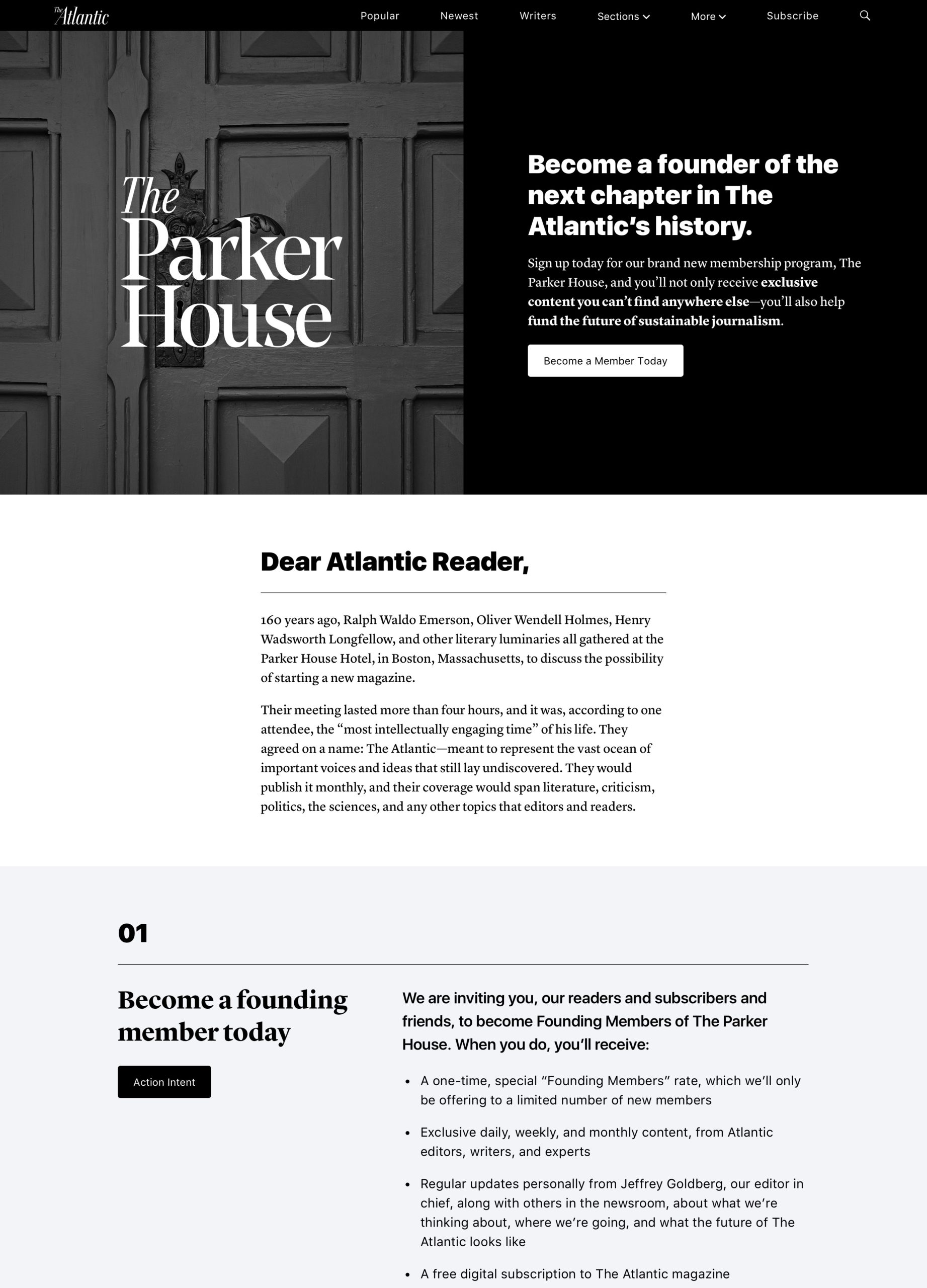
Landing Pages
I worked on a few one-off landing pages that allowed me the opportunity to push and explore different visual styles.
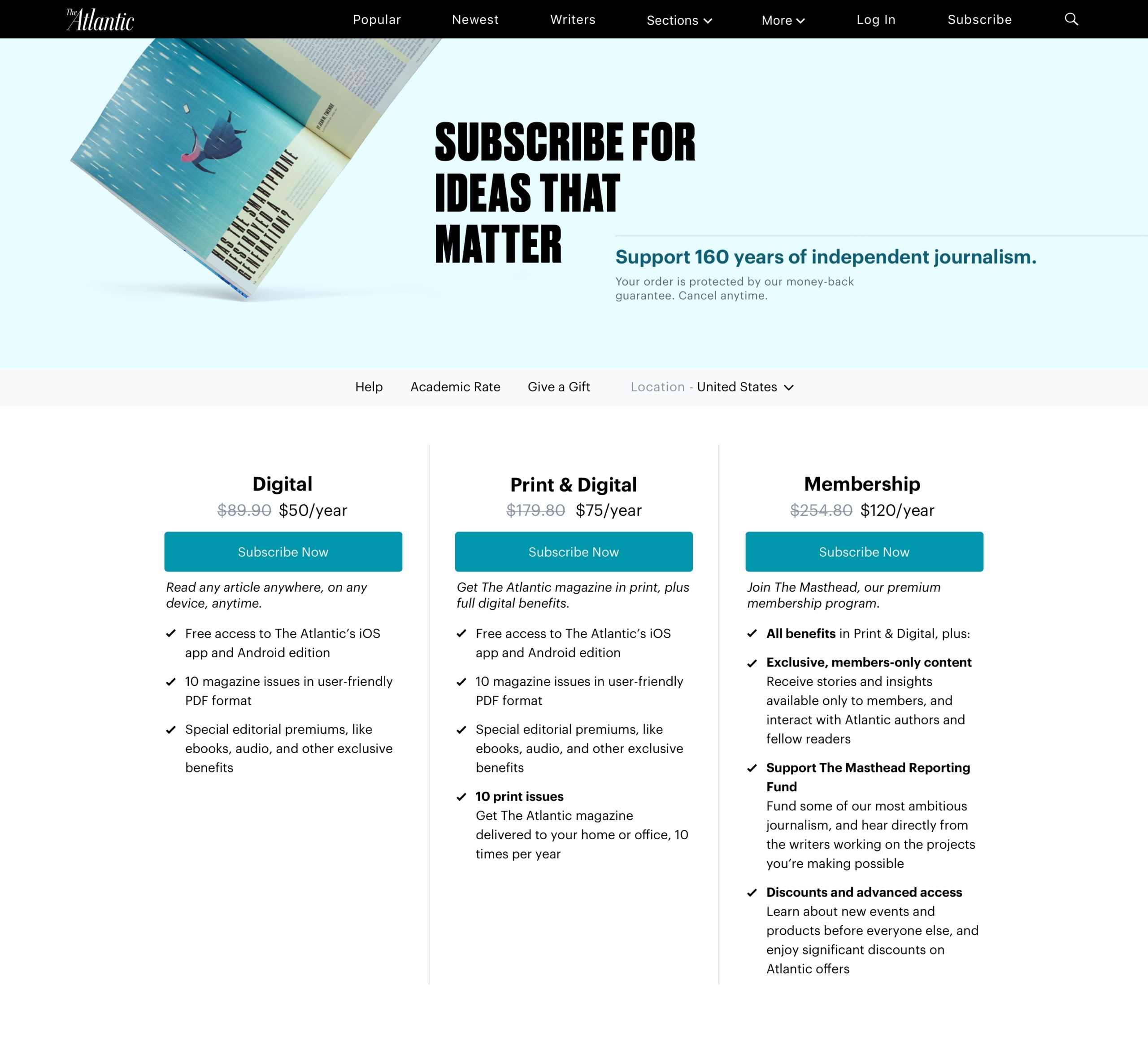
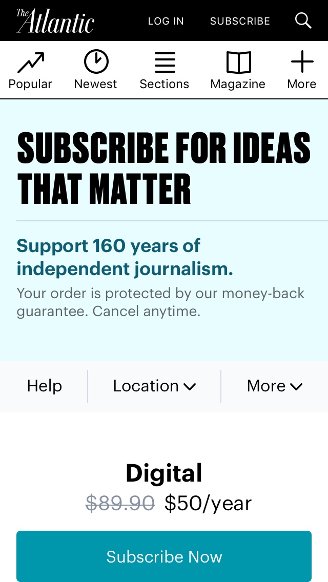
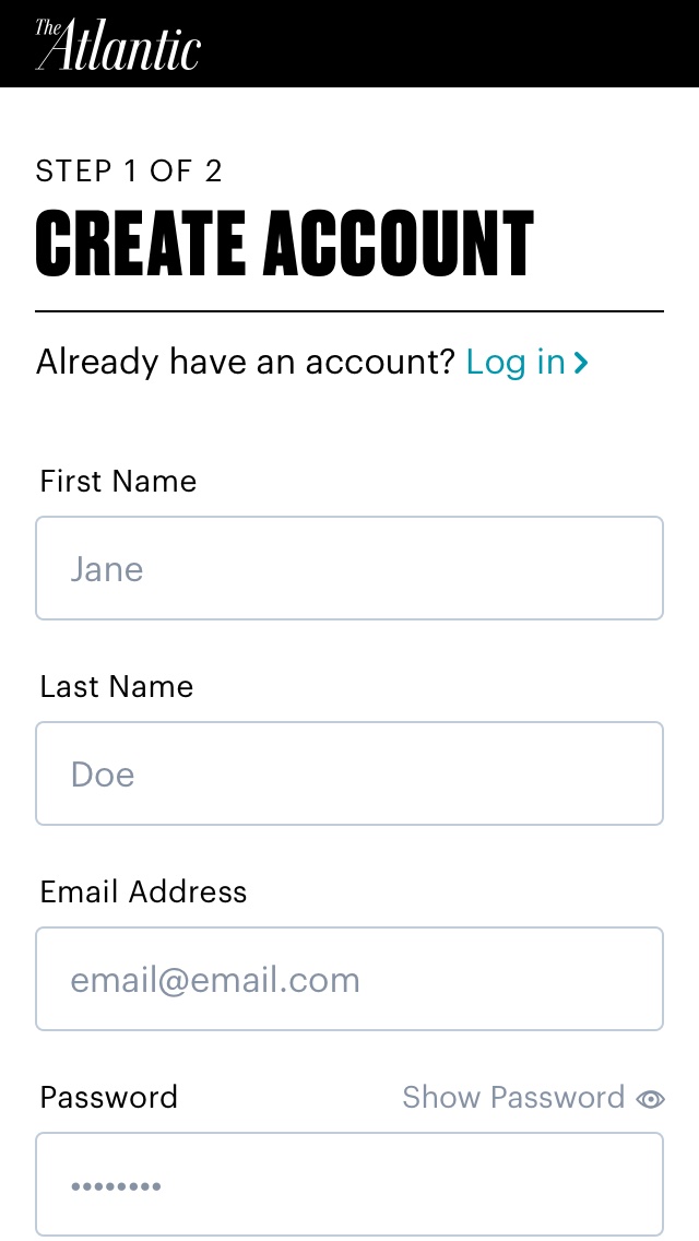
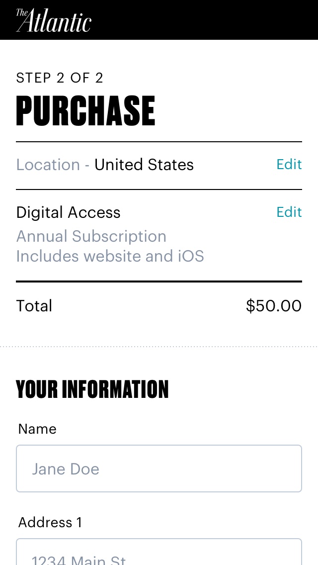
Subscription Experience
I was a part of the first phases in a large shift to a subscription based model. We did a lot of user testing and analysis of other subscription-based publications to determine how we can make this painful shift as painless as possible for users.