The Atlantic iOS App
I worked alongside DJ Brinkerhoff to overhaul the design and UX of our iOS app. From my time working on USA TODAY's app, I already had a lot of ideas for where I thought we could take this project. This work also gave us an opportunity to explore how to systemize our styles and components within a contained project that would later inform our web design system.
CREDITS: DJ BRINKERHOFF
ROLES
Research
User Testing
UX Design
UI Design
Prototyping
PLATFORM
iOS App
YEAR
2017
ROLES
Research
User Testing
UX Design
UI Design
Prototyping
PLATFORM
iOS App
YEAR
2017

The Goal
The current app was buggy, poorly rated, and poorly maintained. The relationship with The Atlantic's current iOS development vendor had soured and the app became less of a priority for them. We noticed, that while the audience of the app was low compared to our web audience, they were loyal. We saw this loyalty as an opportunity to do something more.
Our goal was to give our users an app experience that was simple and accessible, heavily focused on typography, and had a seamless subscription experience.
Wireframes and User Flows
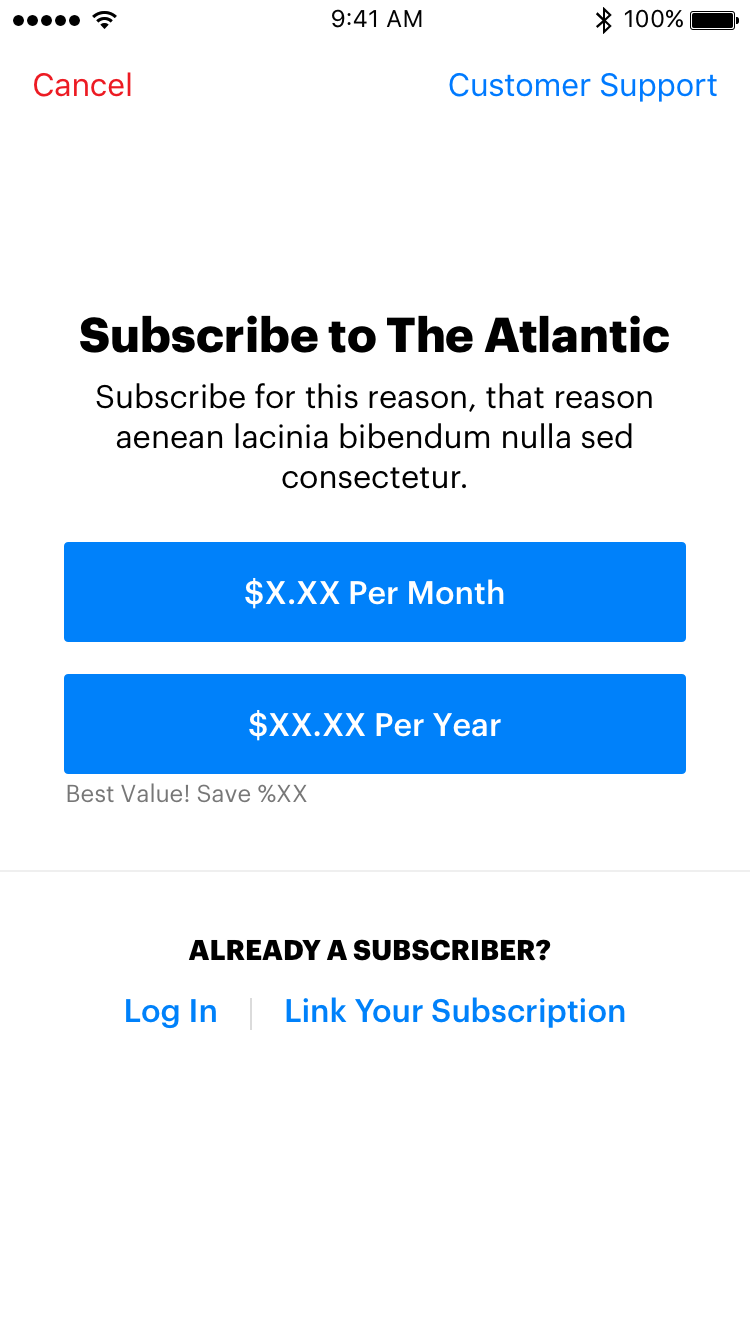
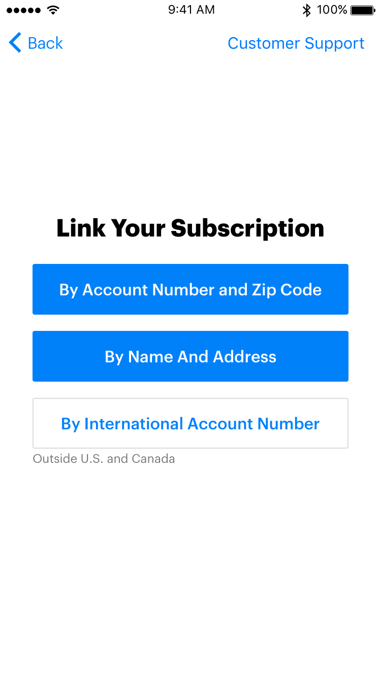
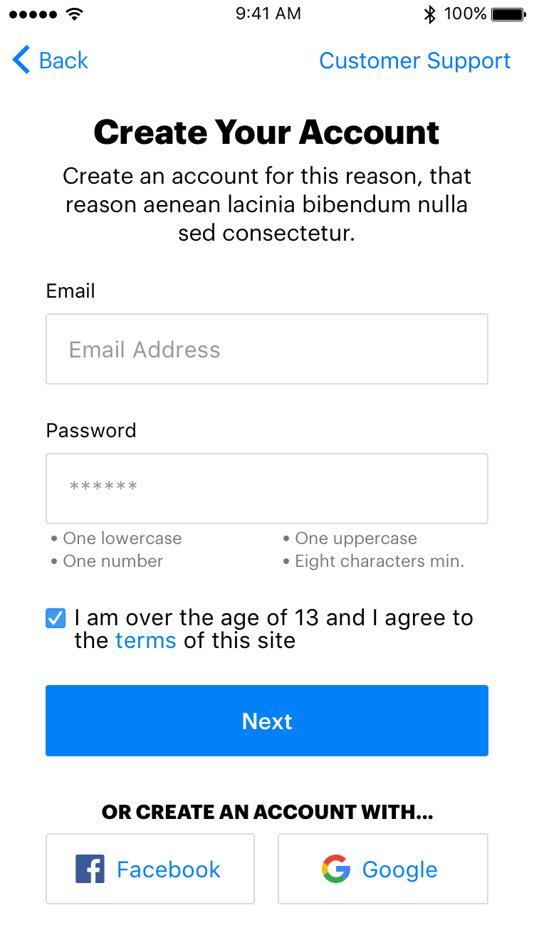
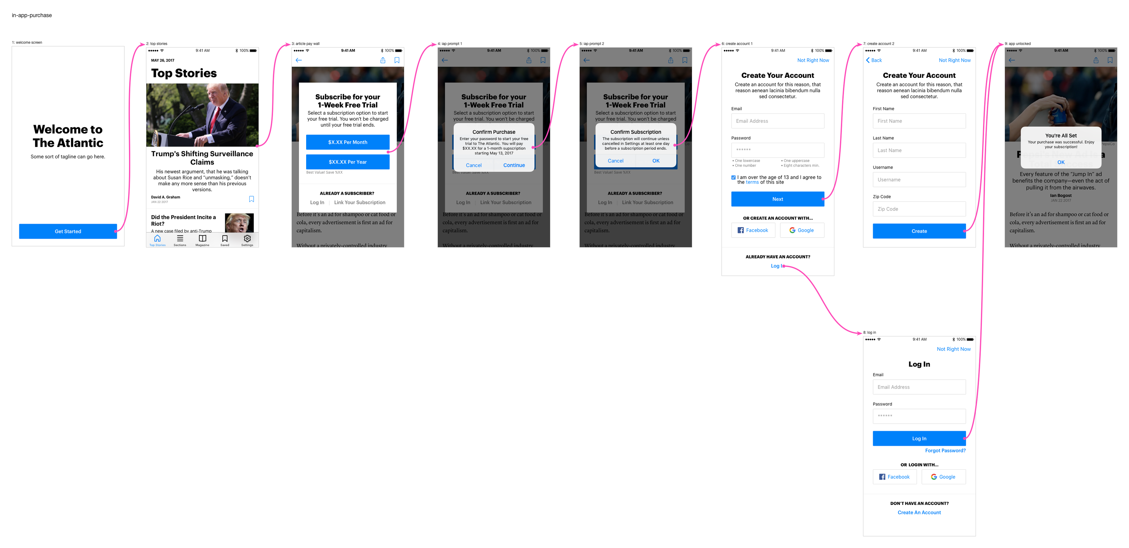
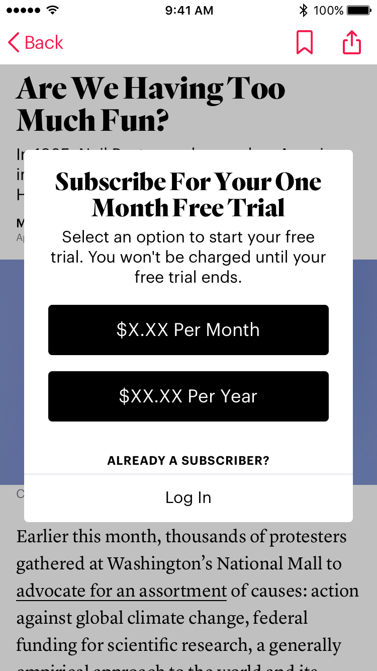
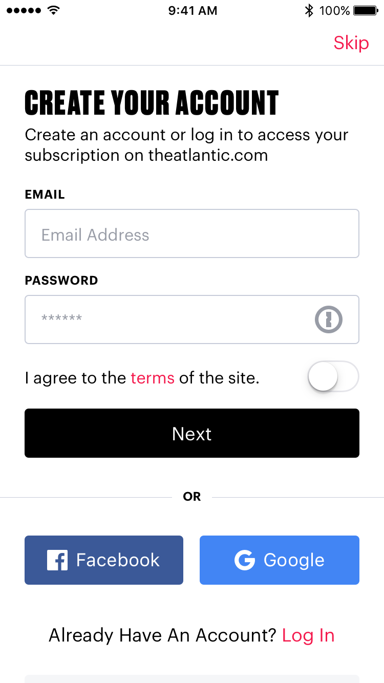
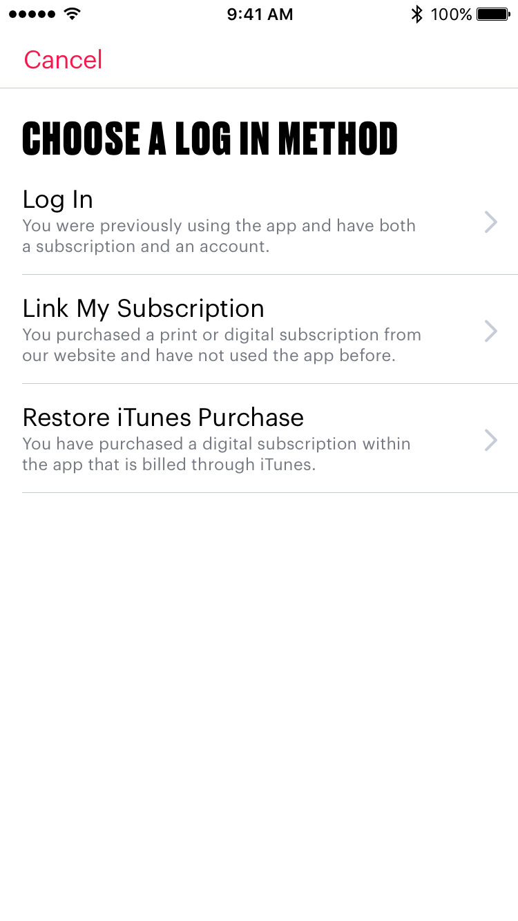
I designed the wireframes and user flows for the subscription experience. I took what we learned from our competitors while also considering the constraints brought on by Apple to develop the clearest and simplest flow possible.
Final Designs
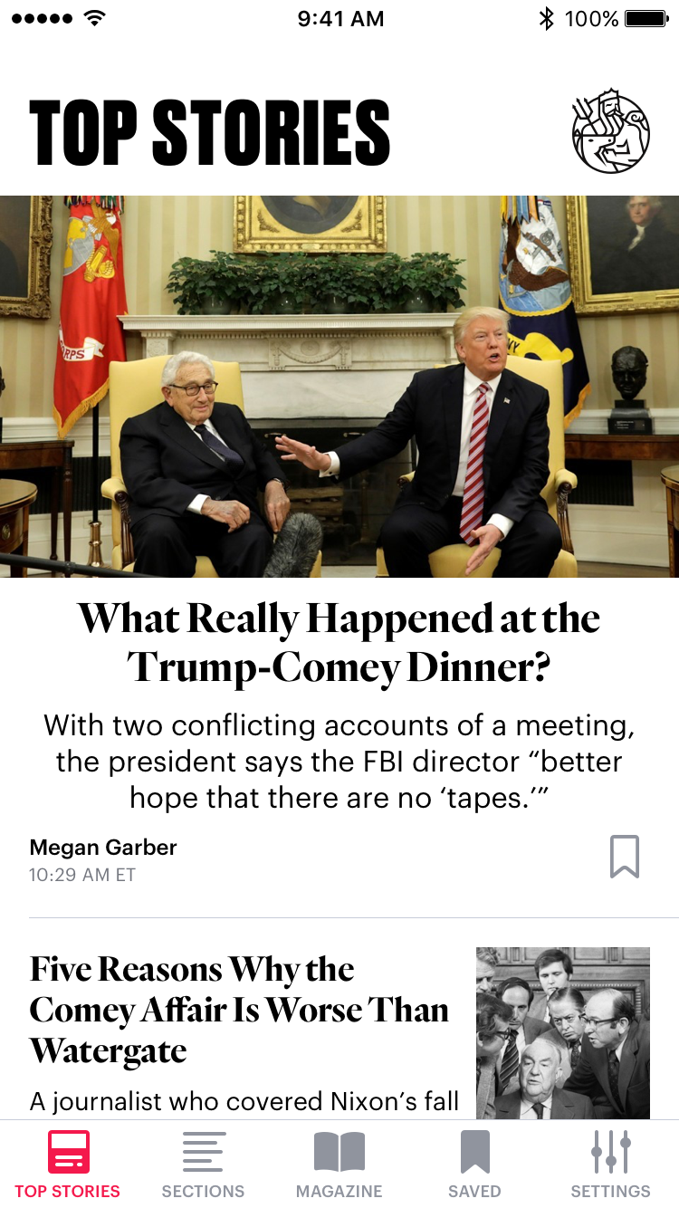
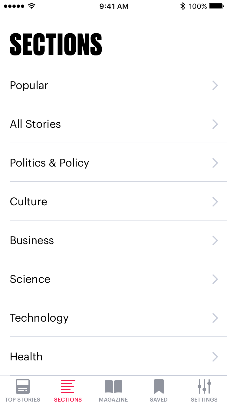
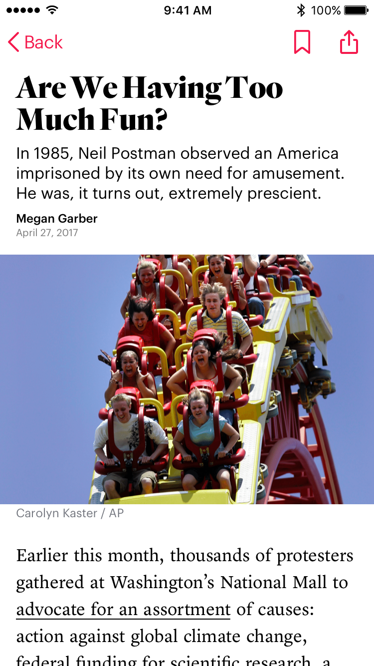
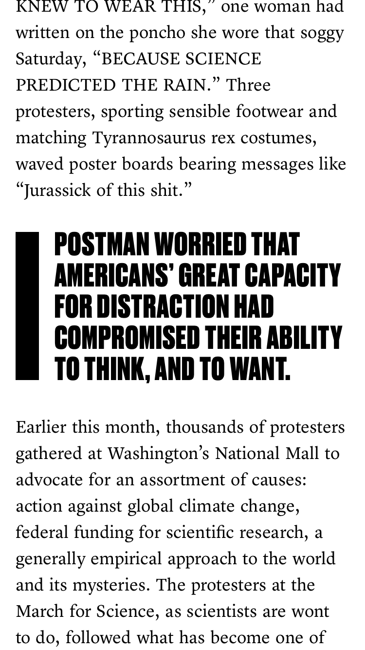
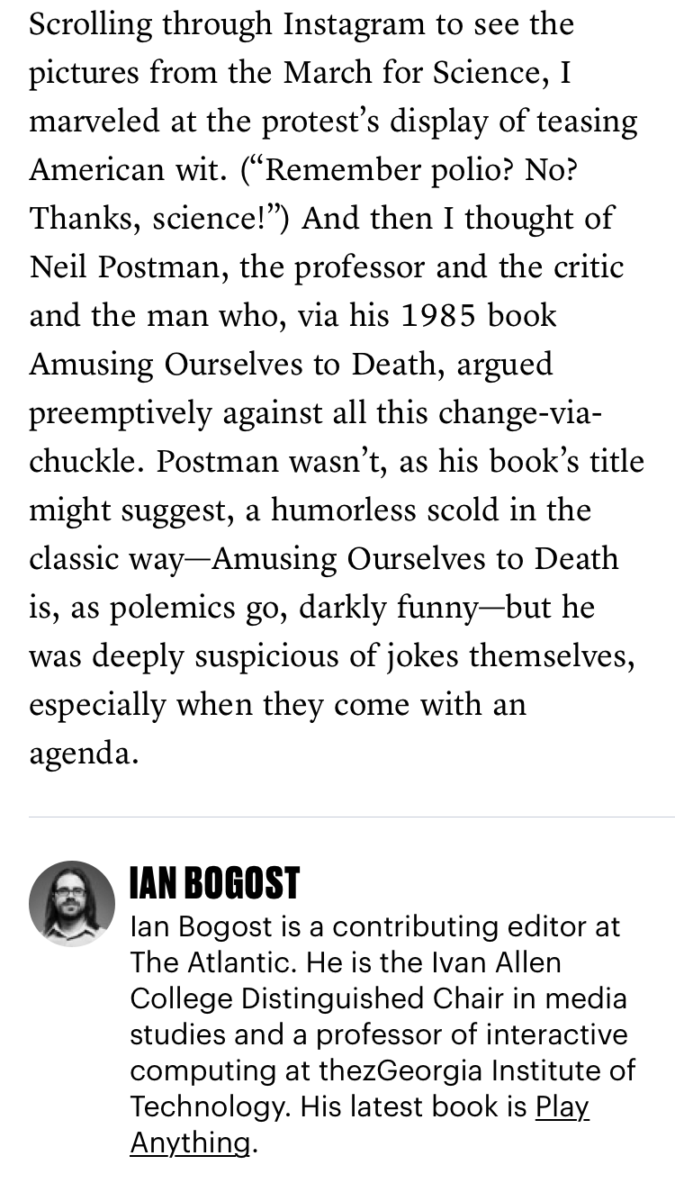
The timing of our app redsign effort coincided with a refresh of our branding with new fonts, colors, and styles. We blended the new branding into our designs and it gave the app a new life. The final execution of our designs emphasized strong, bold typography and gave users a minimal, elegant reading experience.
Animations
While this was our MVP for the app, we still wanted to include a few simple animations to elevate the experience with moments of surprise and delight.
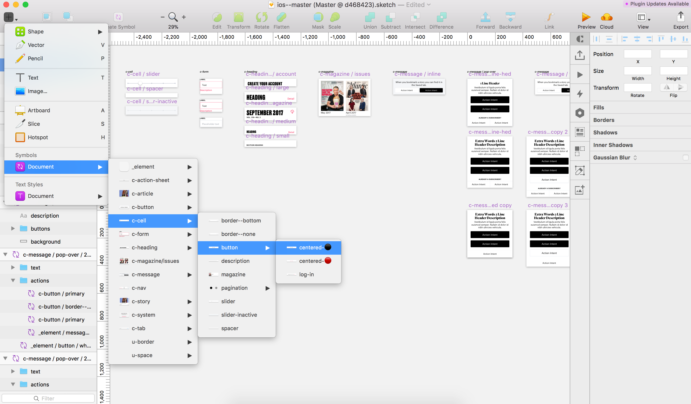
Symbols
I developed a full symbol and style library to systemize and attempt to future proof our design assets. I leaned heavily on vanilla Sketch features, and away from plugins to ensure stability of the library.
