USA TODAY
I worked on some high profile projects for USA TODAY such as the website redsign and native application redesigns. It was a fun challenge to take a well known brand and consider how it should be translated into a digital environment. This case study is a showcase of my contributions to efforts to elevate and rethink the brand.
CREDITS: EAMONN BOURKE, DANA SCHIEFFER, JON DANG, MARIANNE EPSTEIN, RICH BLOOM, THEO ROBINSON
ROLES
Research
User Testing
UX Design
UI Design
Prototyping
PLATFORM
Website
Native Apps
YEAR
2014 - 2017
ROLES
Research
User Testing
UX Design
UI Design
Prototyping
PLATFORM
Website
Native Apps
YEAR
2014 - 2017
Website Redesign
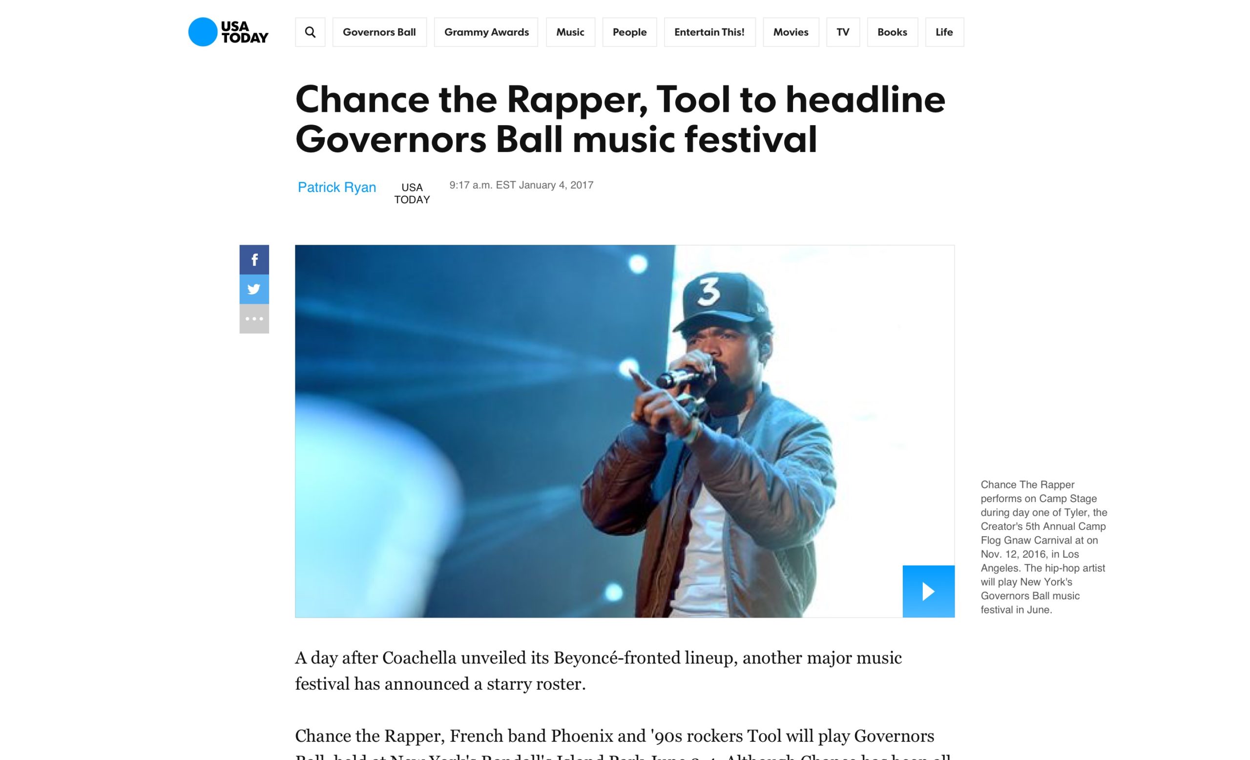
The website redesign was a long and delicate process that is still ongoing to this day. It was a breath of fresh air to take a zoomed out look and explore more progressive ideas for USA TODAY.
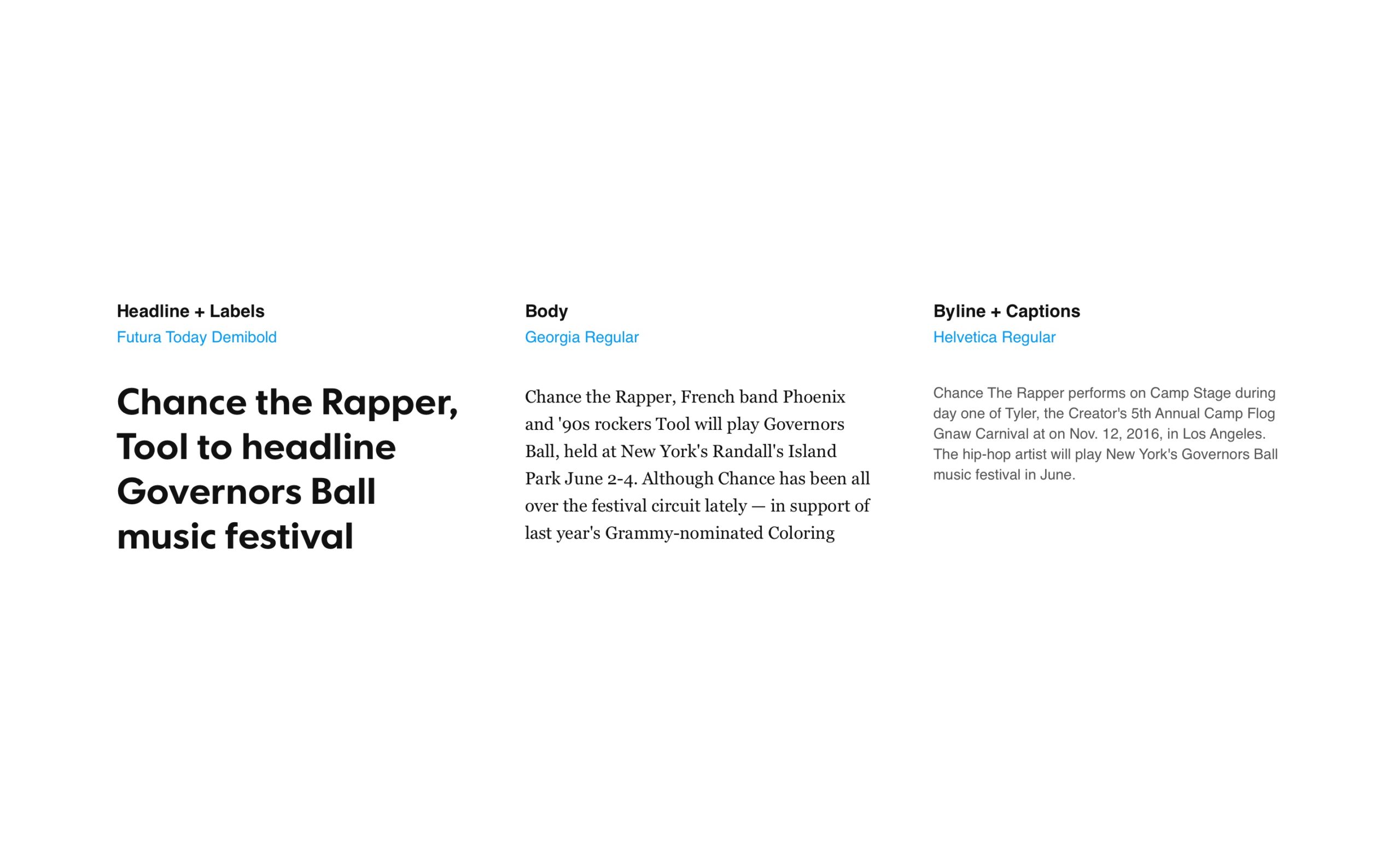
MOODBOARDS
With my moodboards I wanted to modernize USA TODAY and explore layouts with more white space. I also wanted to push us to be more selective when using the brand colors in order to make them more meaningful and impactful.
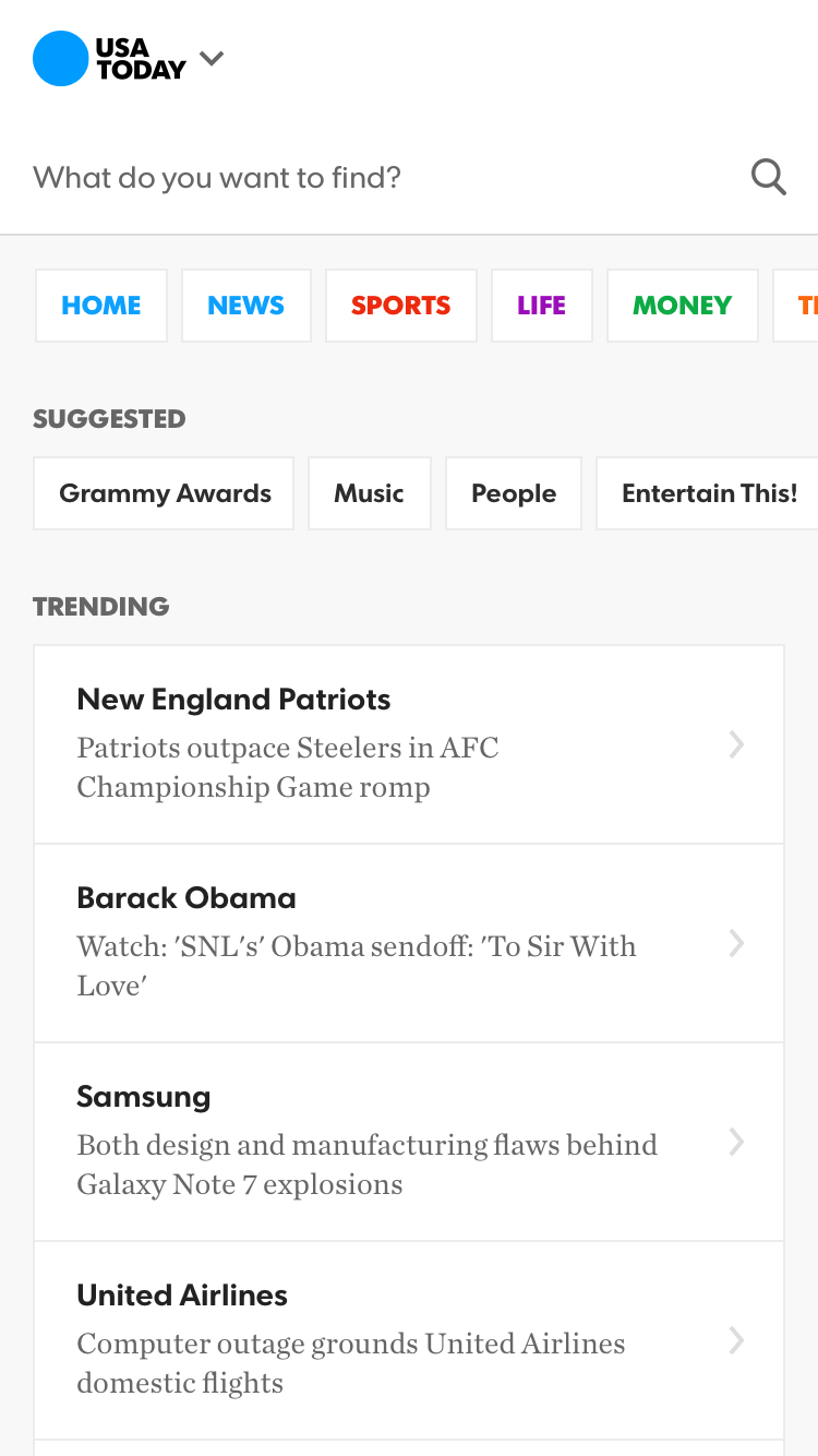
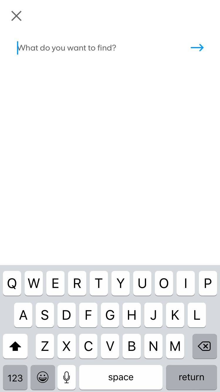
MOBILE DESIGNS
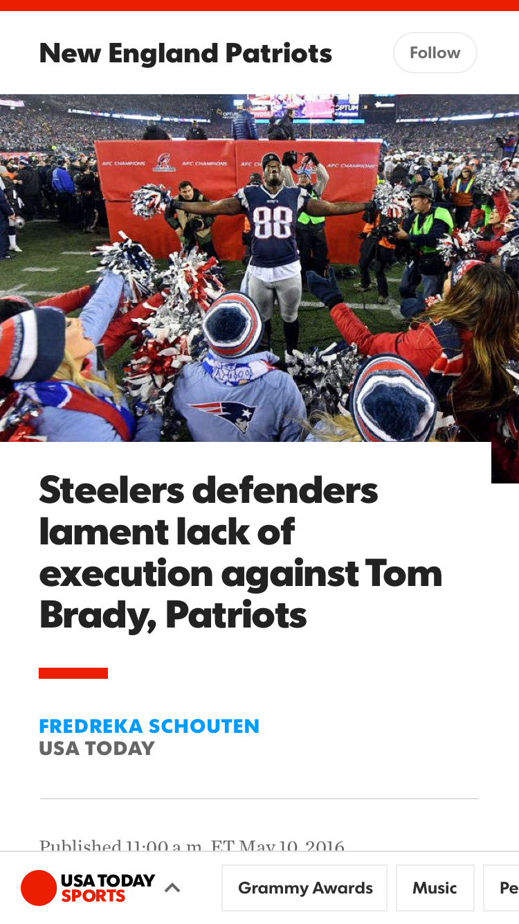
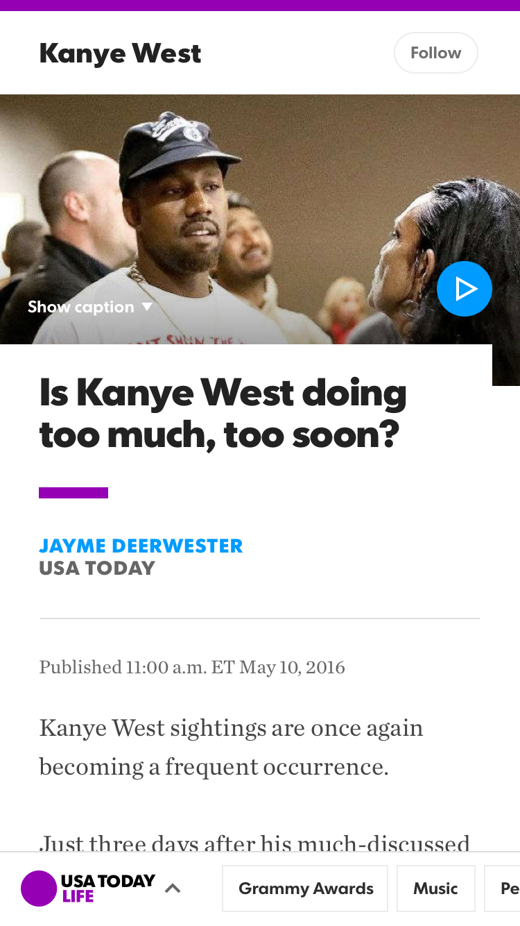
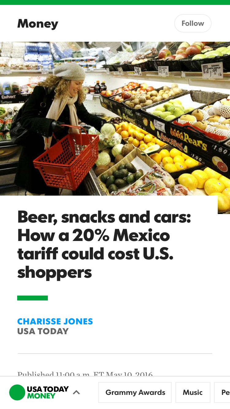
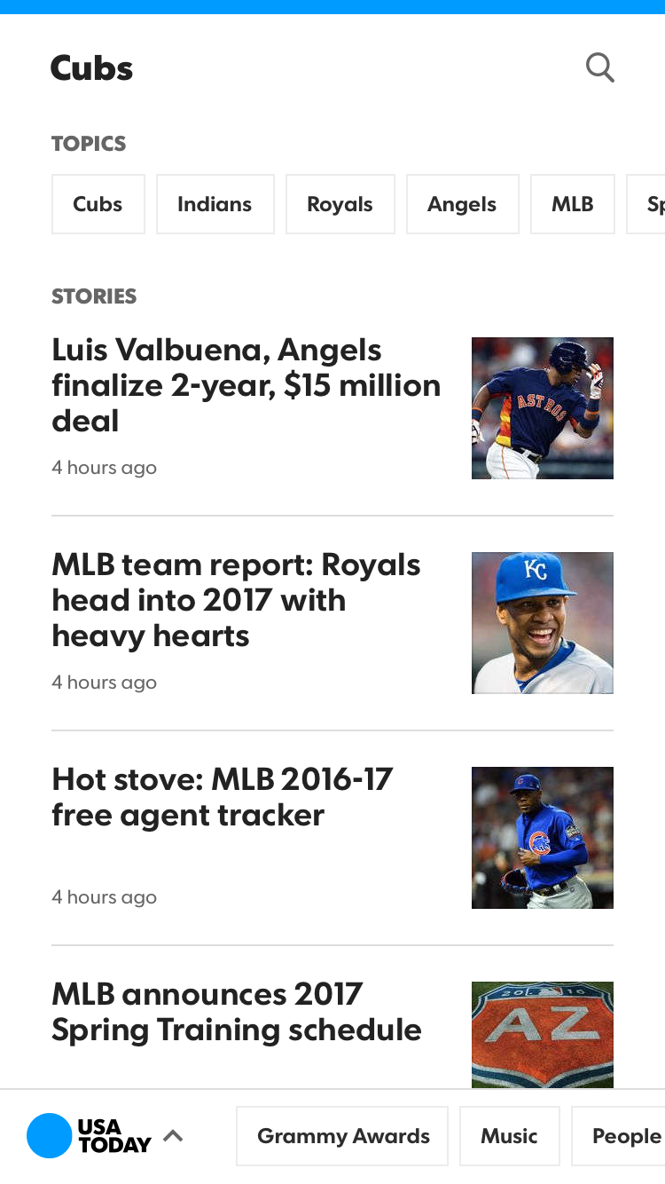
We took a true mobile first approach when designing and executing our site redesign. Some of the key areas I worked on included the topic pages, navigation, and alerts experiences.
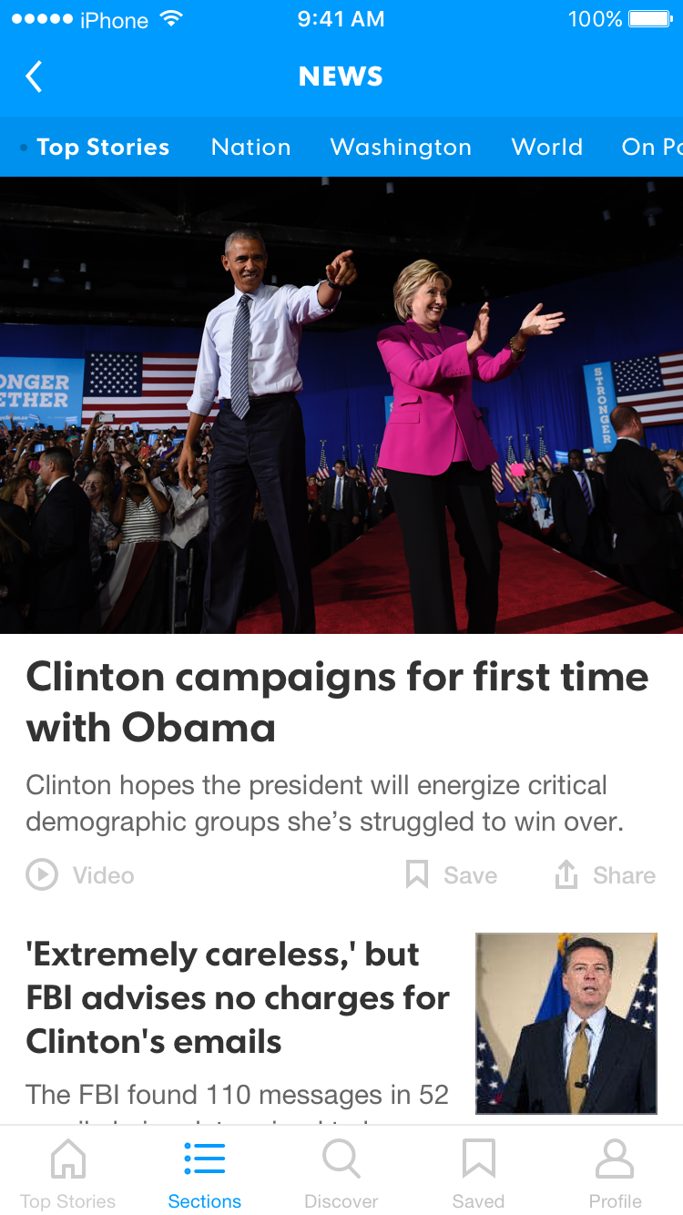
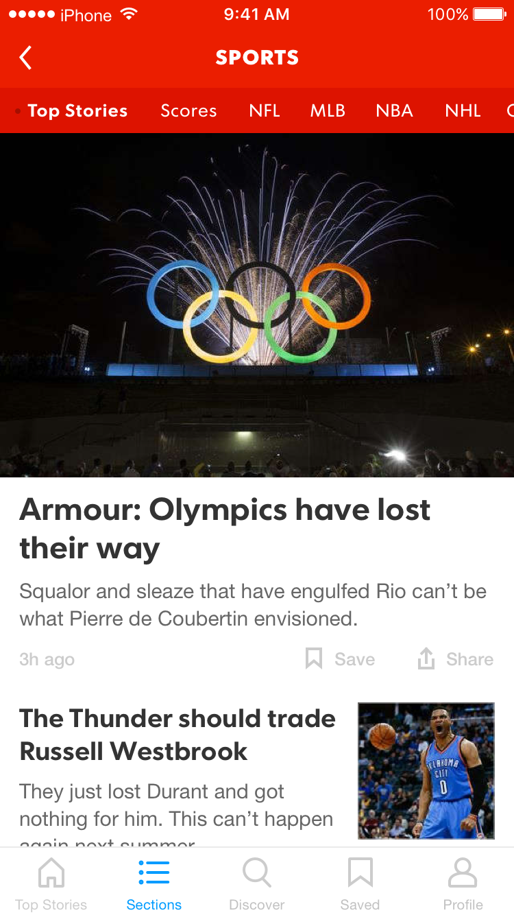
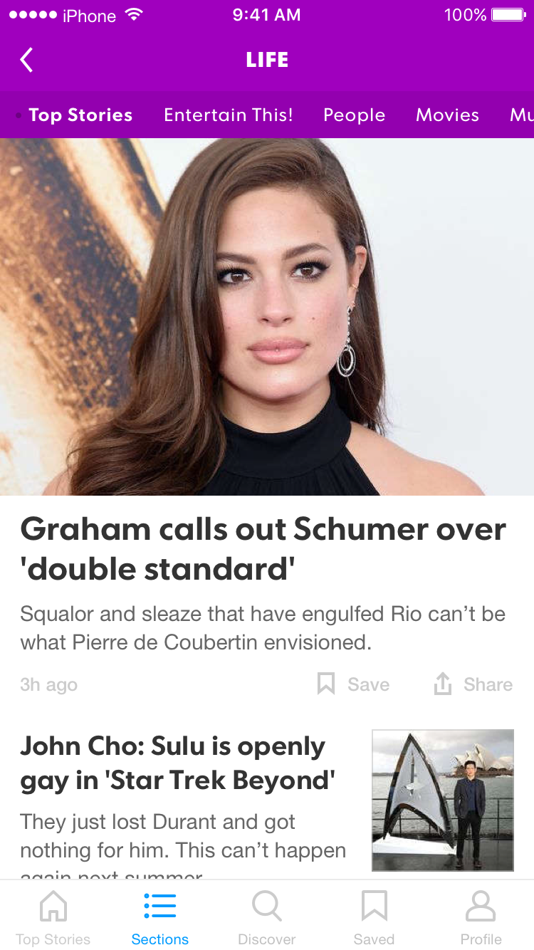
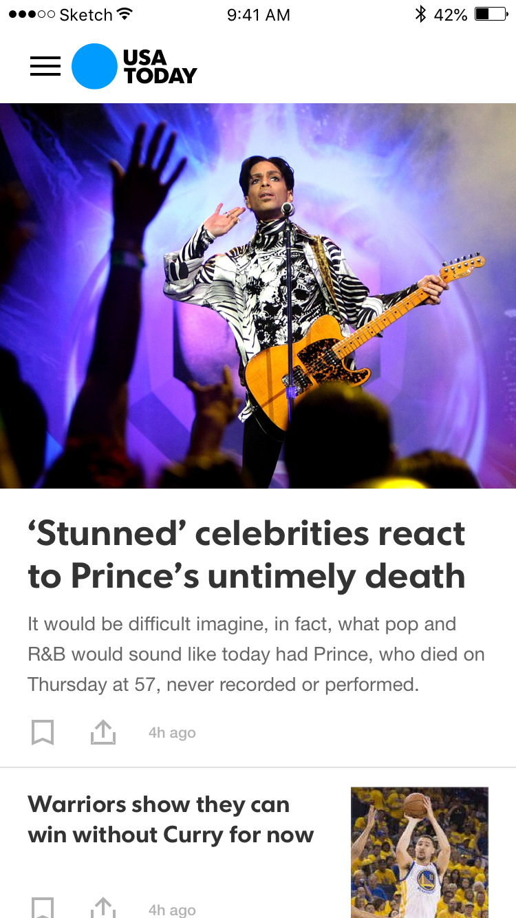
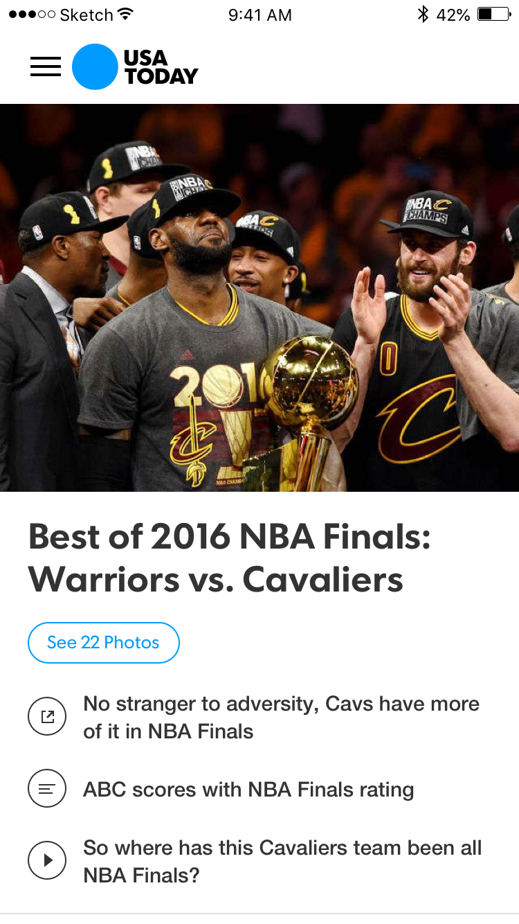
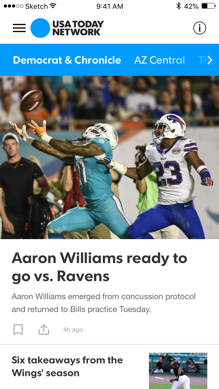
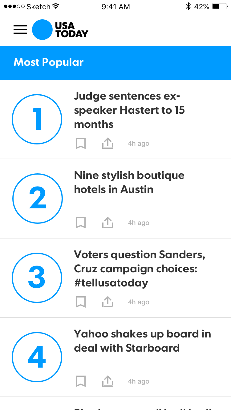
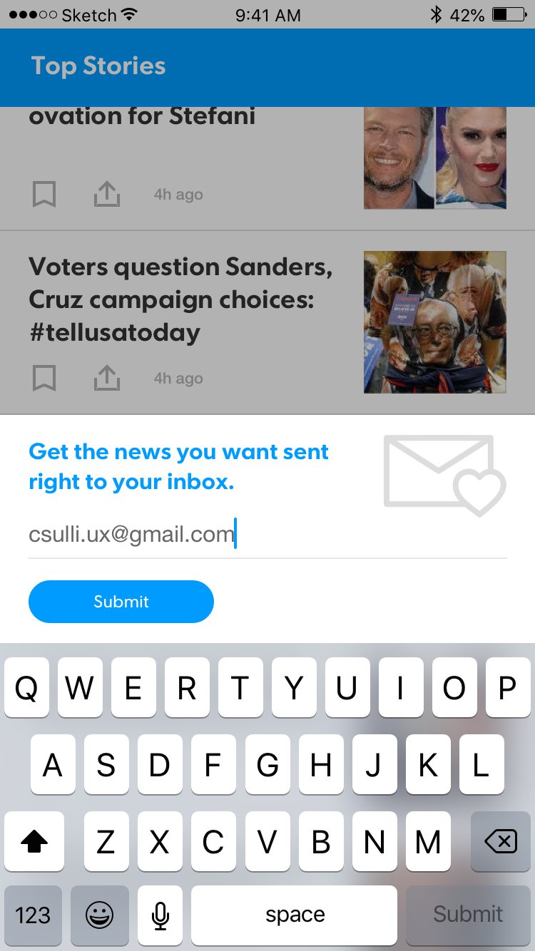
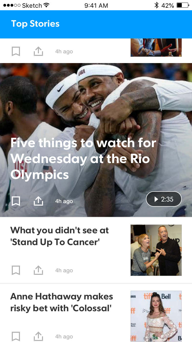
App Redesign
For the app redesign we wanted to focus on scannability and giving users a quick landscape of what's going on that day. USA TODAY's stories are short, sweet, and to the point, so making sure they're all available at a glance fits well with the overall editorial direction of the brand.
IOS DESIGNS
The iOS app was our focal point, which we would later translate into a material design friendly version for Android users. Some highlights of what we did included scannable fronts, local news publications integrated into the experience, and packaged content.
ANIMATIONS
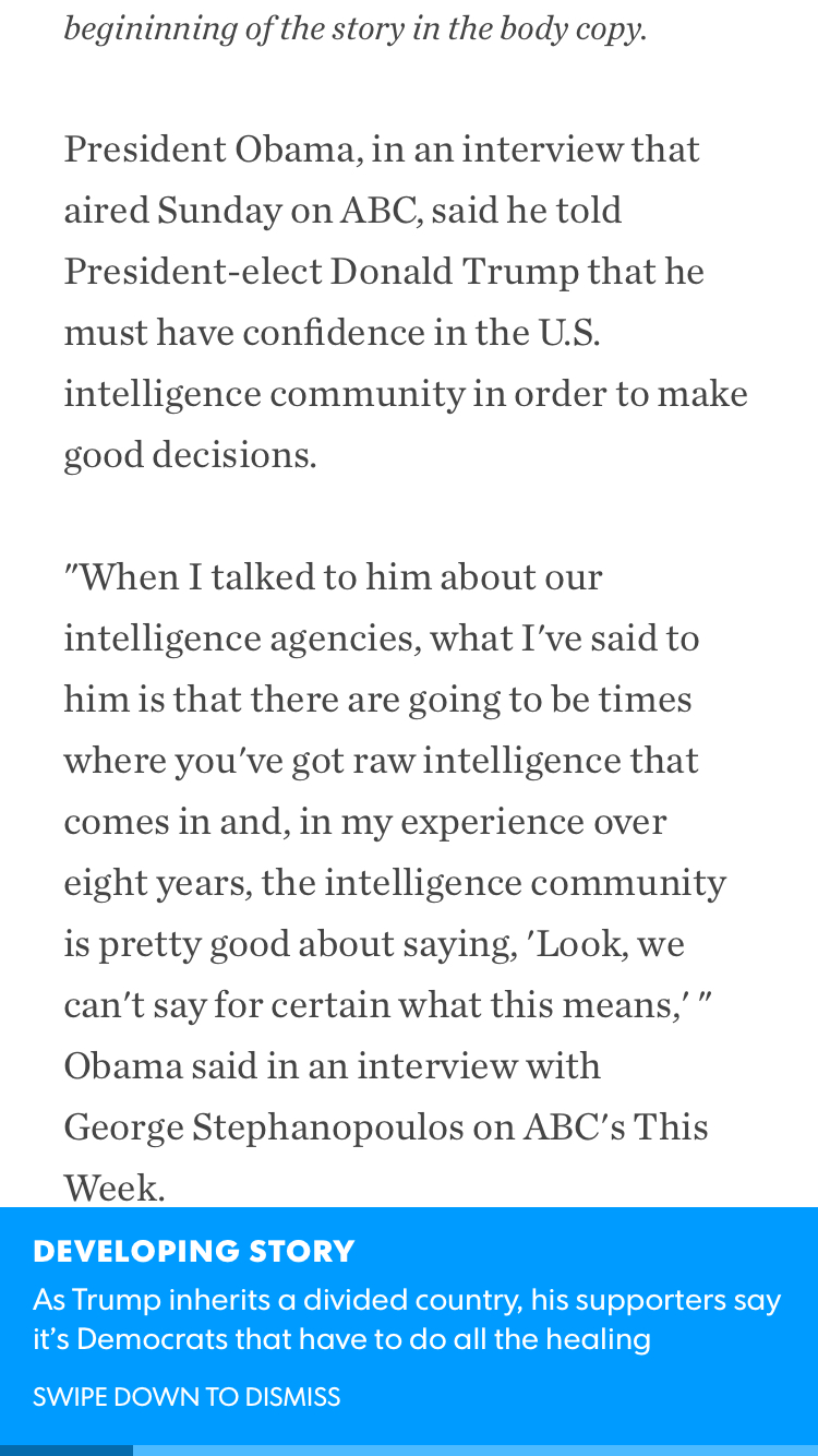
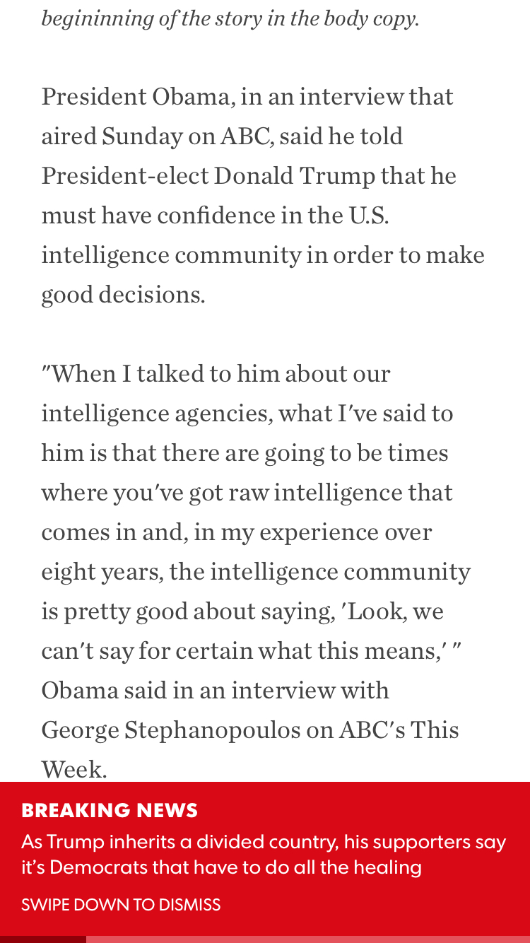
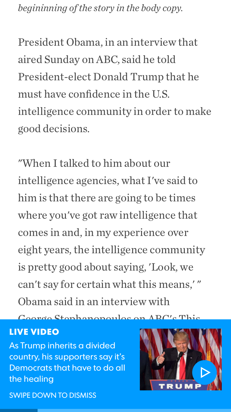
This project is where I started to learn UI animaiton. My primary tool of choice at the time was Pixate, and it really helped communicate with developers and stakeholders about what our vision was for the app experience.
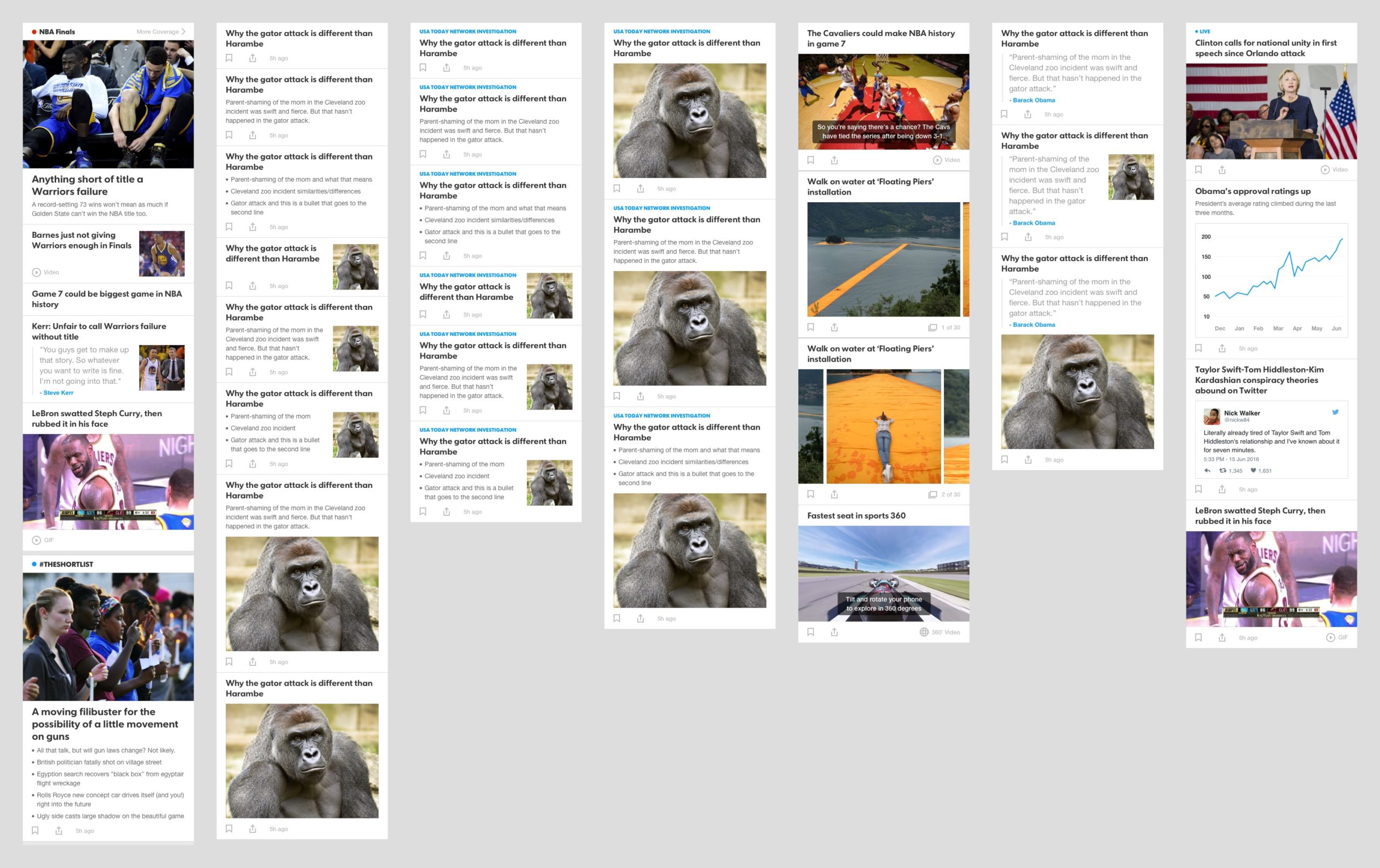
App 2.0
For the next evolution of the app, we investigated some different features and design directions. We looked into doing a bottom navigation, as that is where the app industry was heading as a whole. I also came up with a collection of card types that would give editors more flexibility when curating sections of the app.